Advance Tools for Optimize Your Analysis (ENG)
Crafting Your Maps: Map Editor See Your Maps in Action: Map Viewer Publish Your Idea Here!Updated : 16 Jun 2025
See Your Maps in Action: Map Viewer
Table Viewer
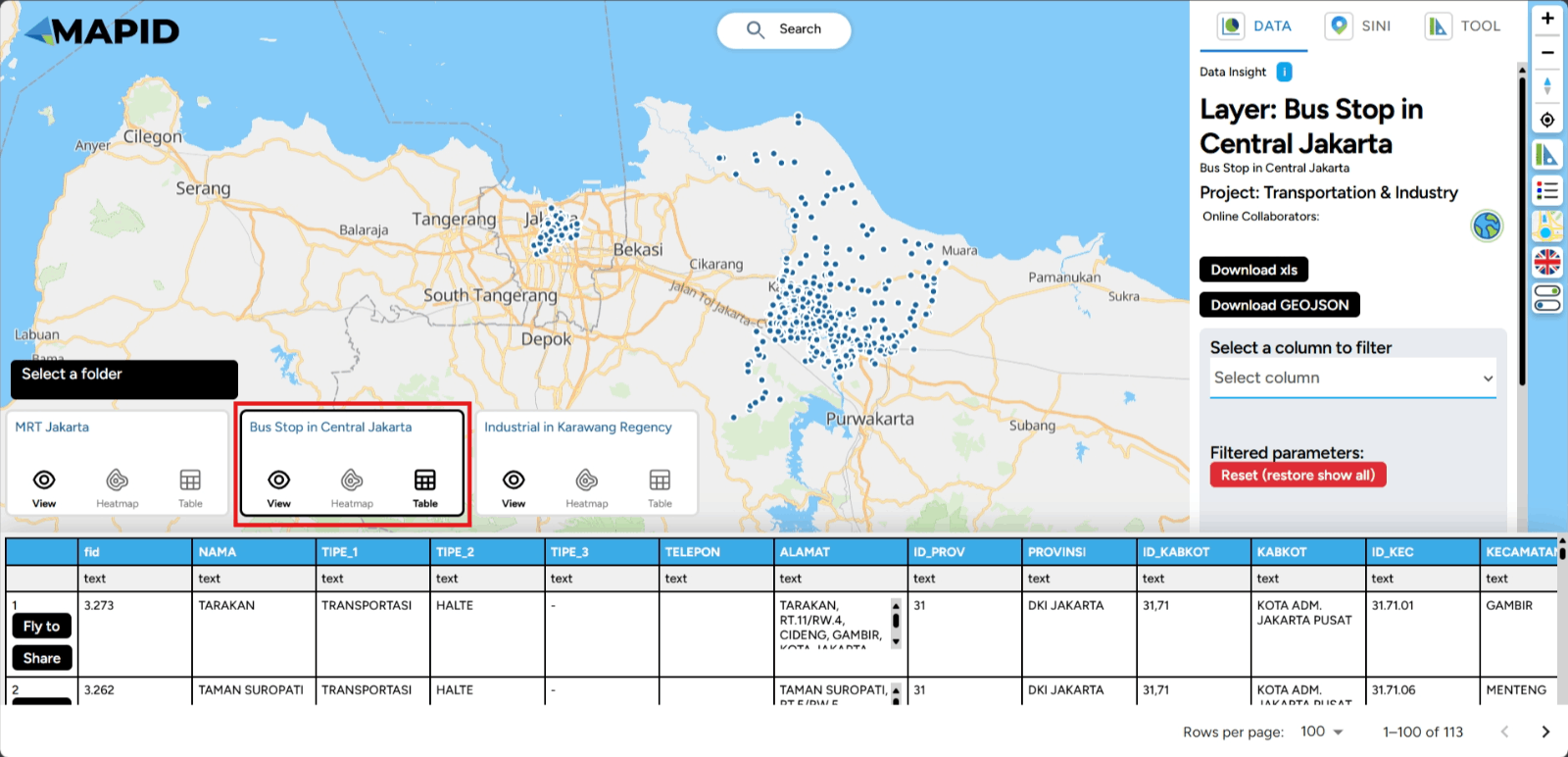
The Table Viewer is a feature that makes it easier for you to view data in a table format. It allows you to view detailed data clearly, perform searches, filter information, and sort based on your needs.
Using this feature is very easy. You can choose the project you want to open in Map Viewer.
Once you open a project, you will also be able to see the layers within that project.
To view the attributes in the layer, simply click the table icon as shown below.
Done! You will now see the attribute table inside your layer, which contains the details of the layer's information. It's that simple, right?
Heatmap
A Heatmap is a data visualization that displays the intensity of activity in an area using color. These colors can represent levels of activity. For example, brighter colors like red or yellow indicate high activity, while darker colors like blue or green show low activity. GEO MAPID also provides this spatial feature, which you can use to visualize data. So, how can you use it?
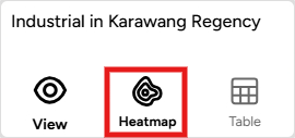
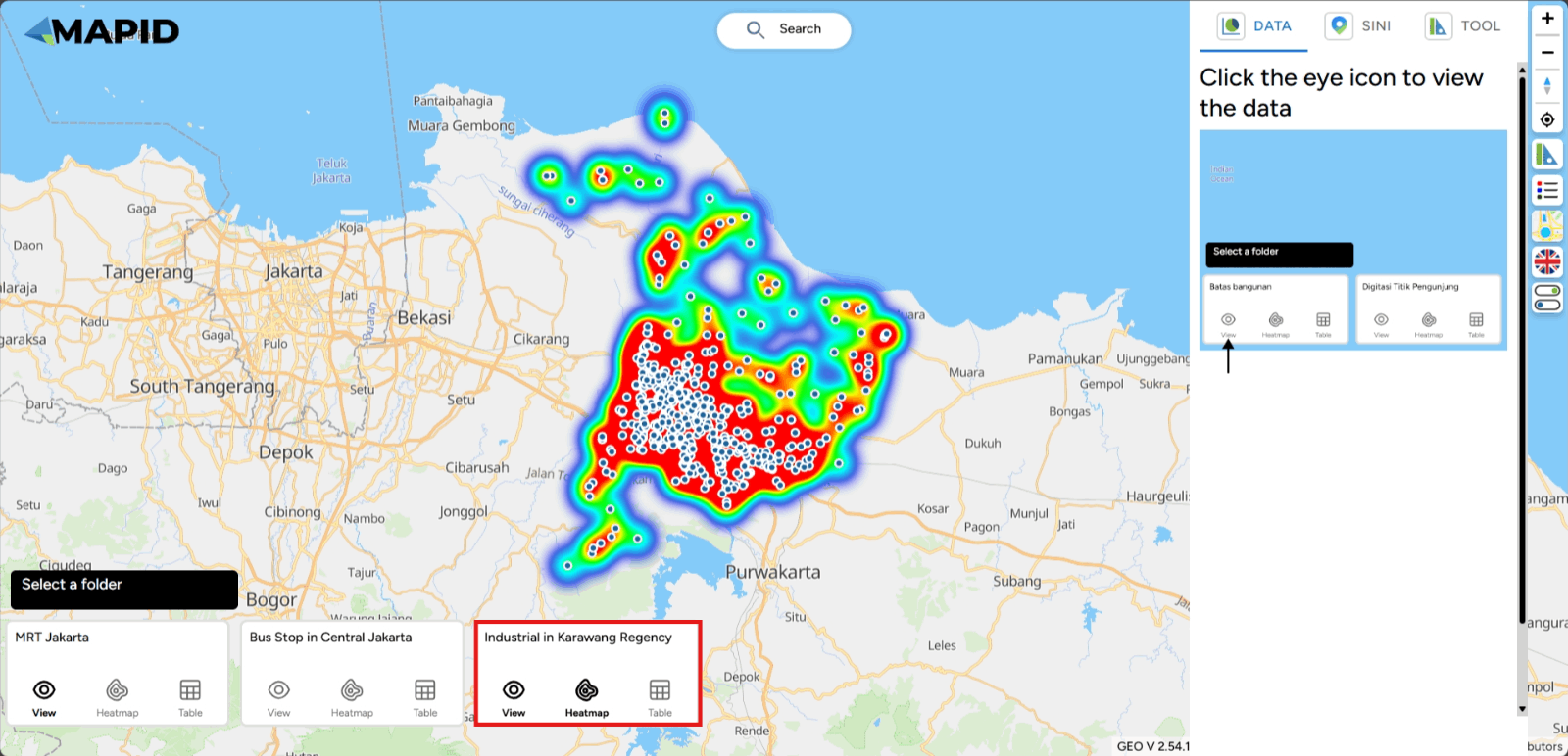
In this example, you can open one of your projects through Map Viewer. For example, using one of the results from the form you’ve created. In the image below, you will find several data viewer icons. To view data using the heatmap feature, simply click the contour icon to visualize the heatmap.
Done! By clicking that icon, you can see the heatmap visualization at specific locations on the map.
All Features in the Right Sidebar
Map Viewer is a feature on the GEO MAPID platform that allows you to view the maps you have. Just like the Map Editor, you can see all the GEO MAPID features there. Below is an overview of the Map Viewer features in one of your projects.
When you first view it, you’ll notice the features are primarily located on the right side of your screen. What features are there? Here’s an explanation:
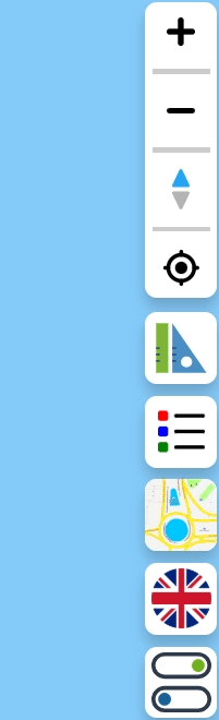
Zoom In, Zoom Out, Compass/Reset Bearing to North, and Find My Location
These features are located at the top of the right sidebar.
- Zoom In: Represented by a plus icon, this feature zooms in or brings the map closer.
- Zoom Out: Represented by a minus icon, this feature zooms out or moves the map away.
- Compass/Reset Bearing to North: This feature resets the map’s orientation to face north.
- Find My Location: This feature centers the map on your current location.
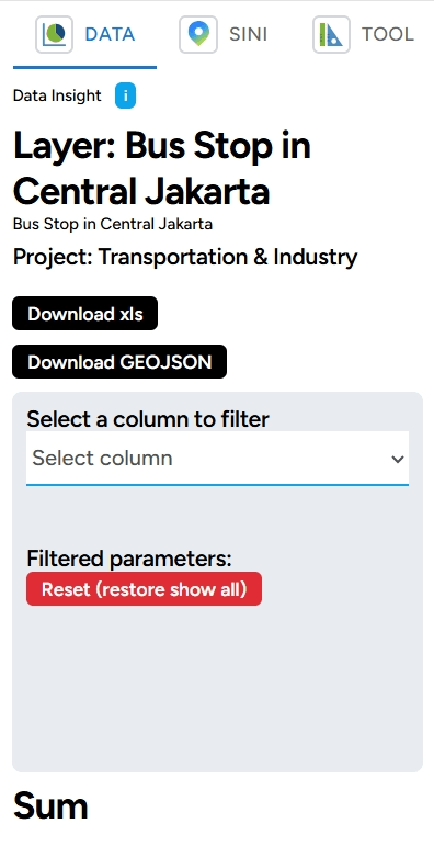
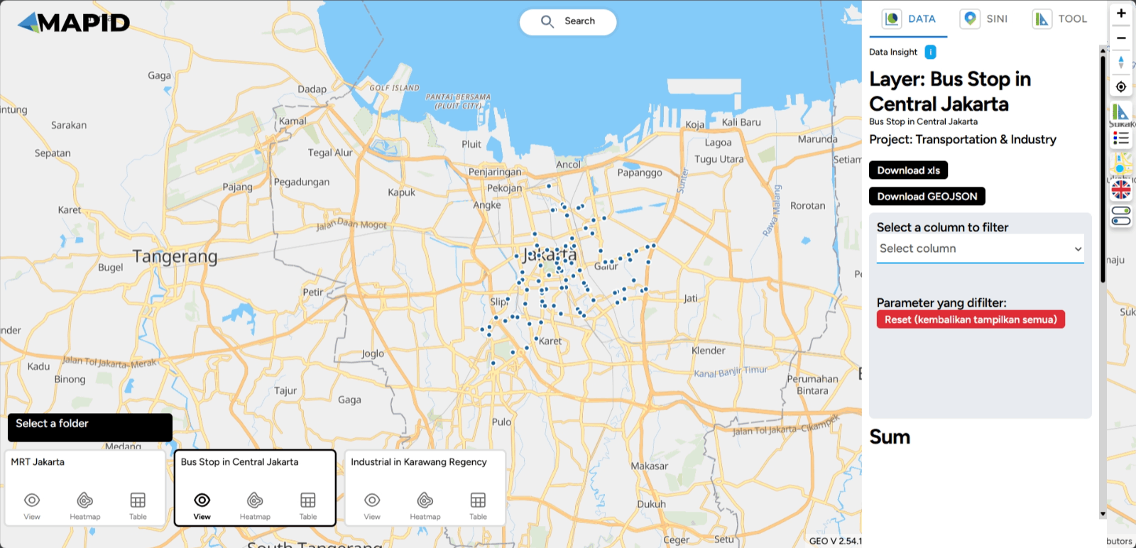
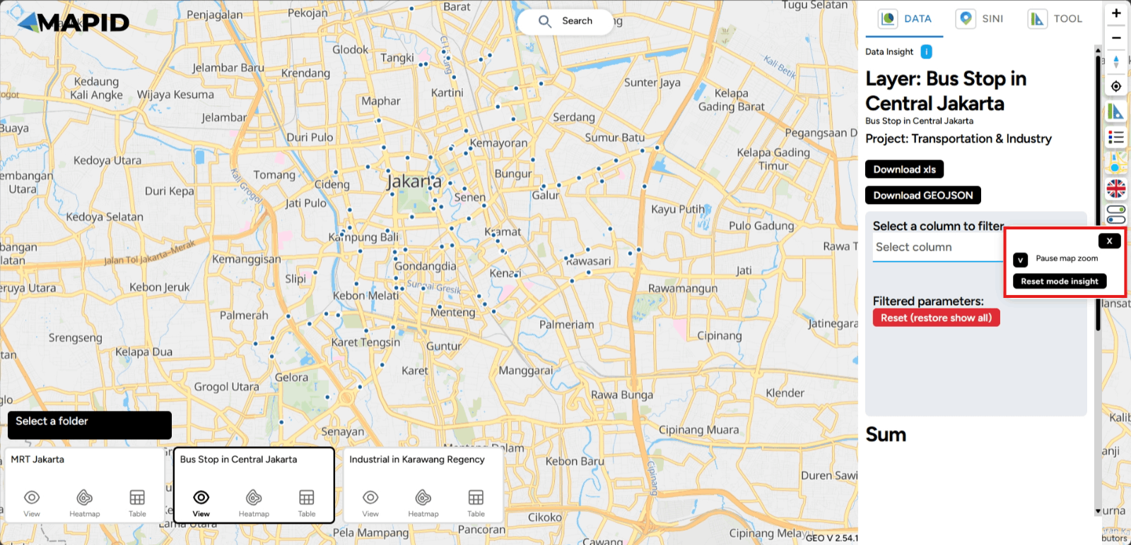
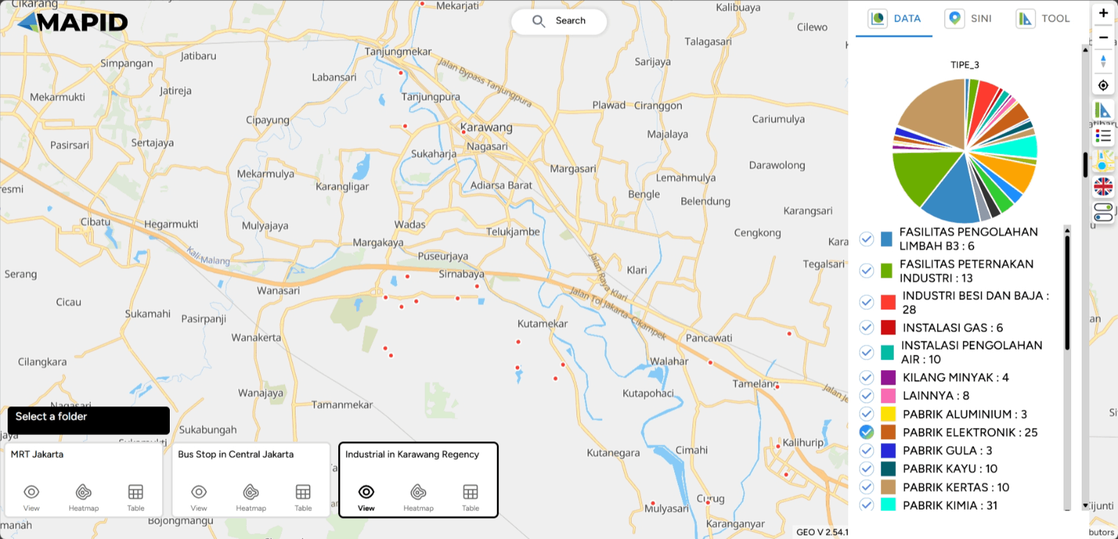
DATA, SINI, and Toolbox The ruler and triangle icons contain the following features: a. DATA: This feature allows you to view data in your layers. Select one of your layer and see the summary.
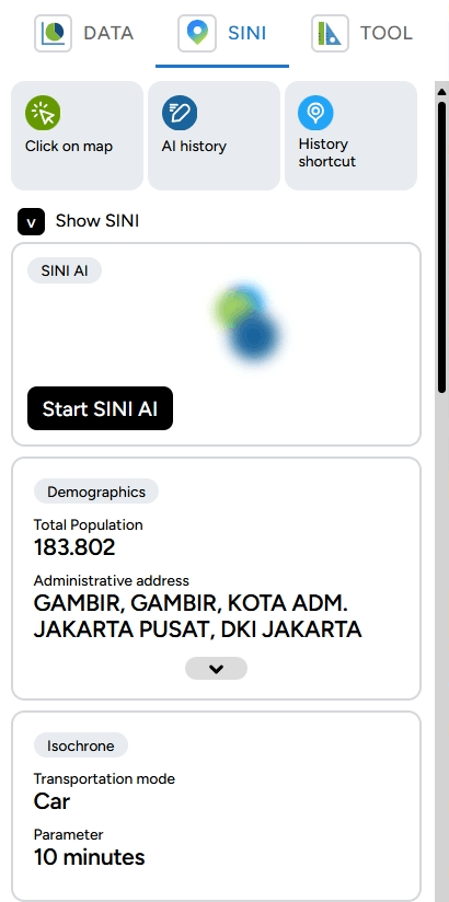
b. SINI: You can use this feature to analyze locations using AI (Artificial Intelligence) in GEO MAPID. Click on the map and see what this location looks like from different angles.
c. Toolbox: This includes features like Distance, Elevation, Area, Radius, Isochrone, and Grid Count Point. Select one of the tools in the toolbox and see the results in action.
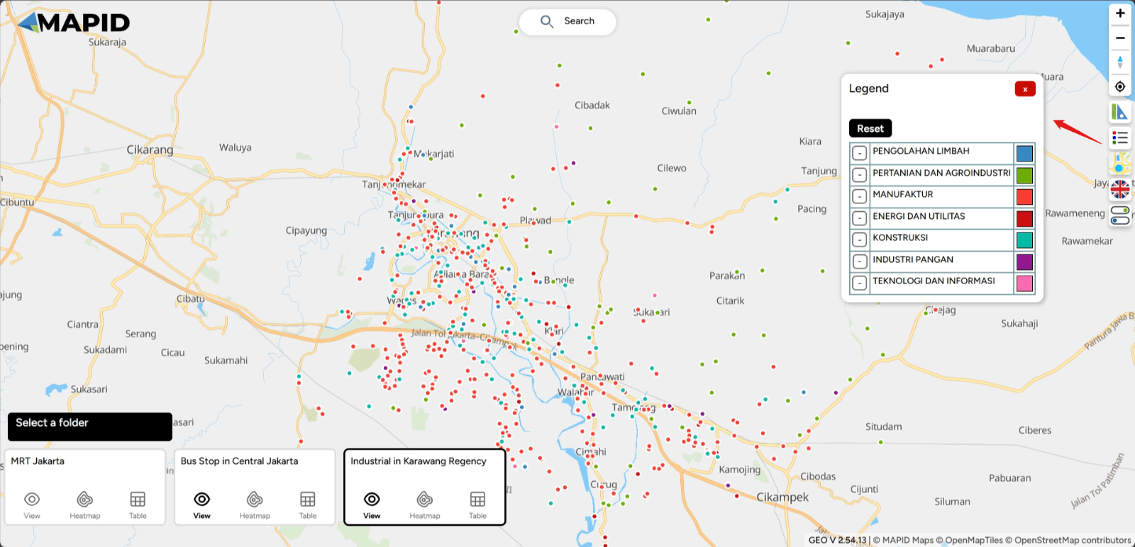
Legend This icon displays the legend for your layers. Select your layer that has been styled via Map Editor and see how your data is classified using one of the attributes from the data.
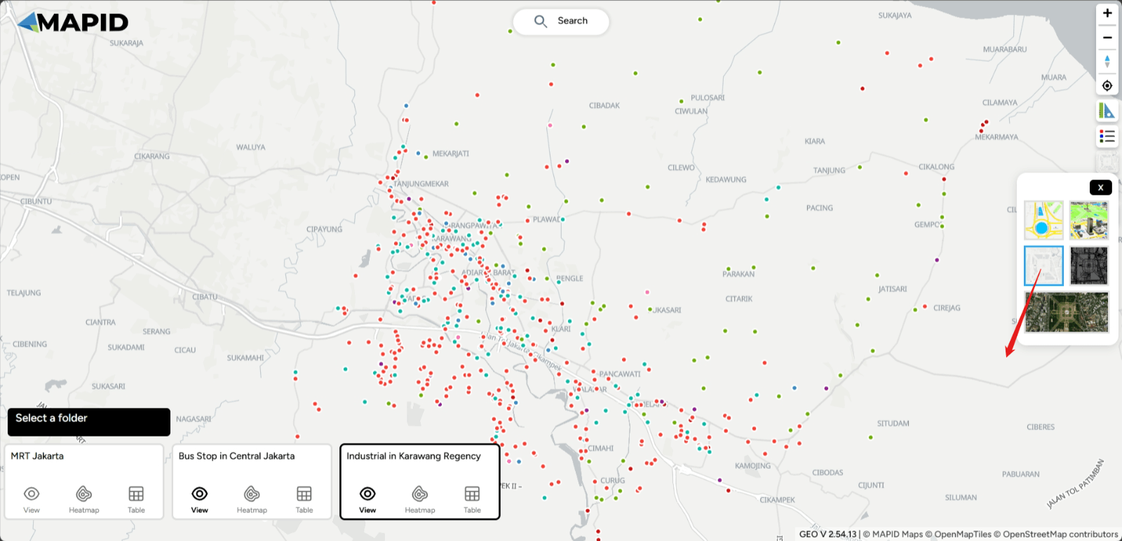
Change Style Map This feature allows you to change the base map or basemap style. You can choose from four basemaps: Street, Satellite, Dark, Light, and 3D Basemap.
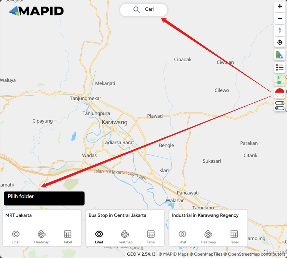
Change Language This icon allows you to change the language. You can choose between Bahasa Indonesia and English. See in Indonesia mode!
Pause Zoom This feature pauses the zooming in or out when you want to focus on one location to prevent the map from shifting.
Deep Dive with DATA, SINI, and TOOLBOX
Data
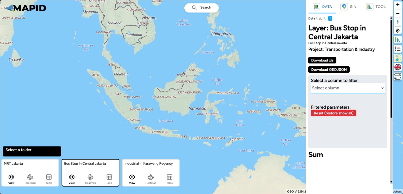
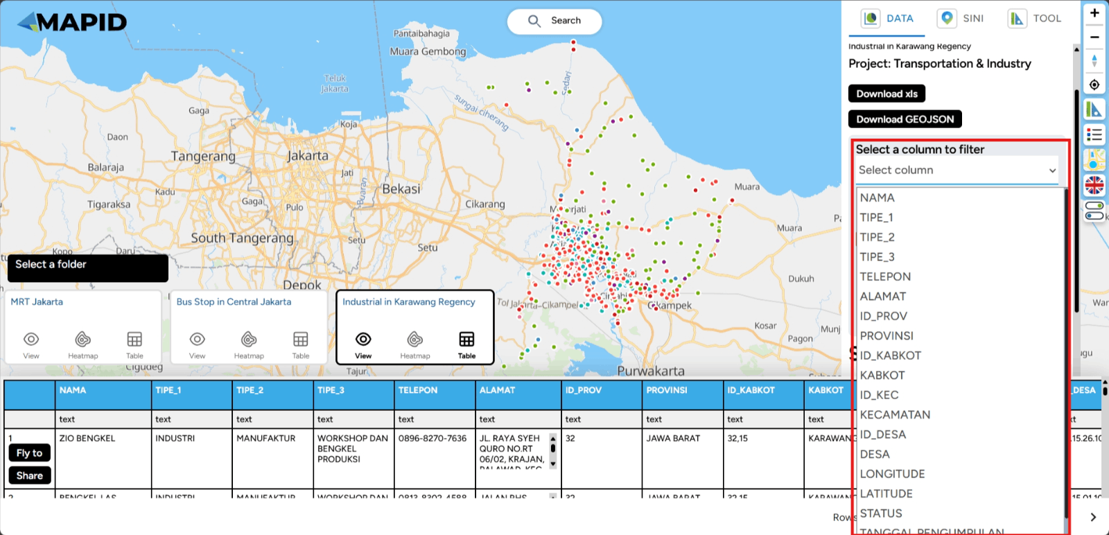
One feature that can help you select specific data or parameters during analysis is the Filter feature (choose the column to filter) in the DATA menu. This feature is particularly useful for narrowing down relevant data according to your specific needs. How can you use it? Follow these steps:
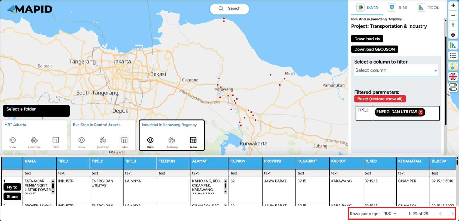
First, you can open one of the projects that has been created, which contains data in the form of layers. You can open it through the Map Viewer feature. Then, you can activate the layer you want to use for filtering the data. For example, in the Transportation & Industry project, there are 3 available layers. Try viewing the Industri di Karawang layer and apply a filter based on TIPE_2 (industry type), then select Energy and Utilities. See what happens!
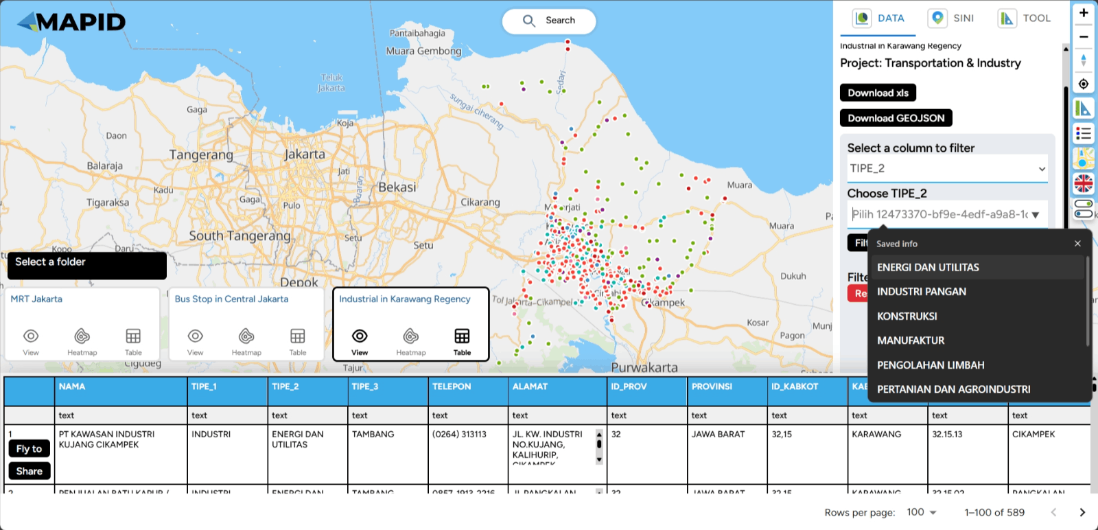
In addition, you can also view a summary of your data in various charts, such as the count by type or information available in the columns of your data. Using the same data, select Show Chart and Grouping All Columns. Sebagai contoh, lihat grafik TIPE_3, dan kamu juga bisa melakukan filter dari grafik yang telah terbuat.
Keep explore your data with this feature and get the summary!
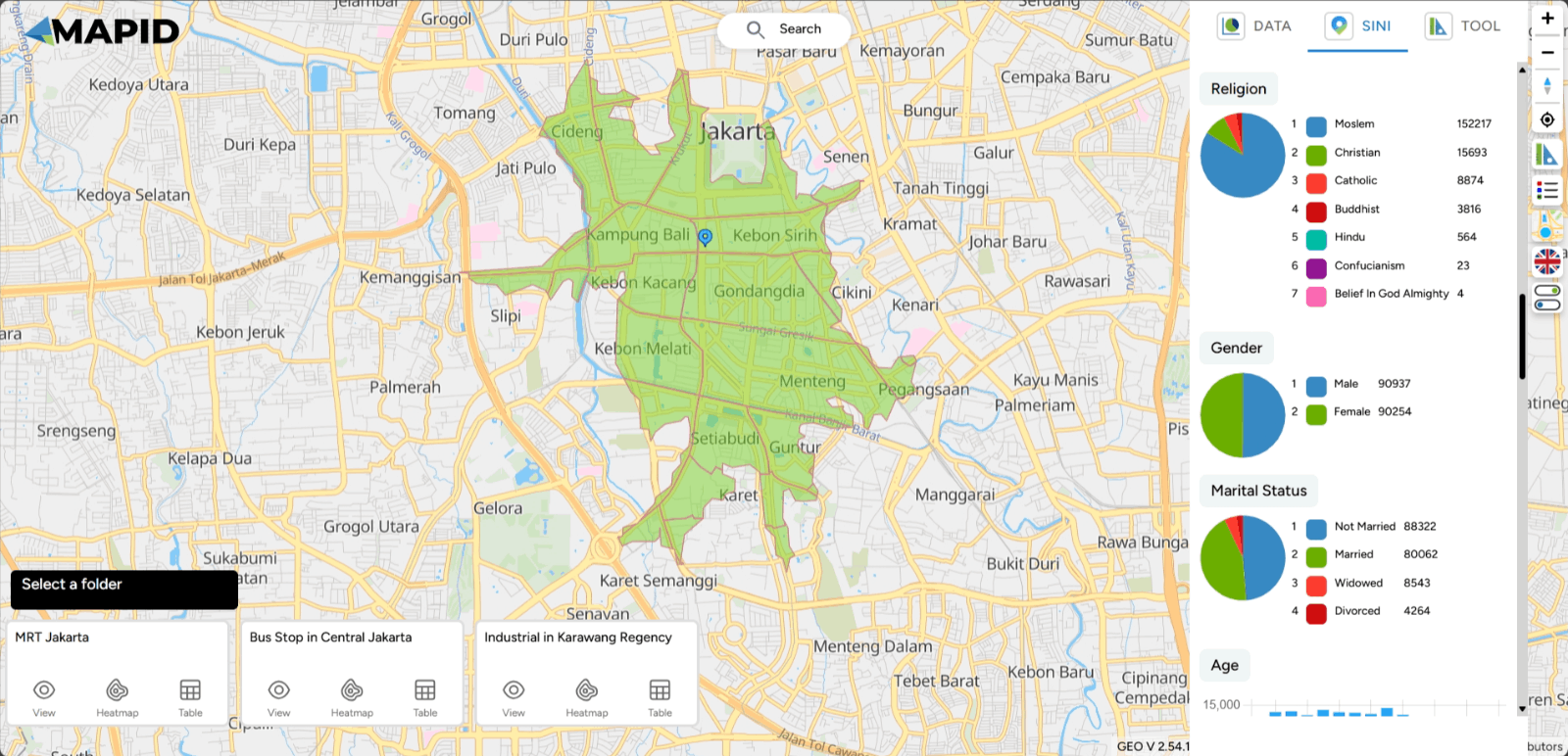
SINI
SINI is an assistant designed to provide location intelligence-based solutions. SINI helps analyze and present information based on geographic and demographic data to understand patterns and formulate strategies in various contexts, such as regional planning, resource management, and more. SINI utilizes location-related data to provide valuable insights, which can be used by individuals, companies, and organizations in making wiser and more accurate decisions. However, this time you can use SINI through Map Viewer, and the usage steps are the same as when opening it through Map Editor.
First, you can open your project via the Map Viewer feature.
Then, you will see the SINI feature in the right sidebar of your screen. To get location analysis from SINI, you can click Click on the Map or click the ( + ) icon and then click on the desired location point on the map.
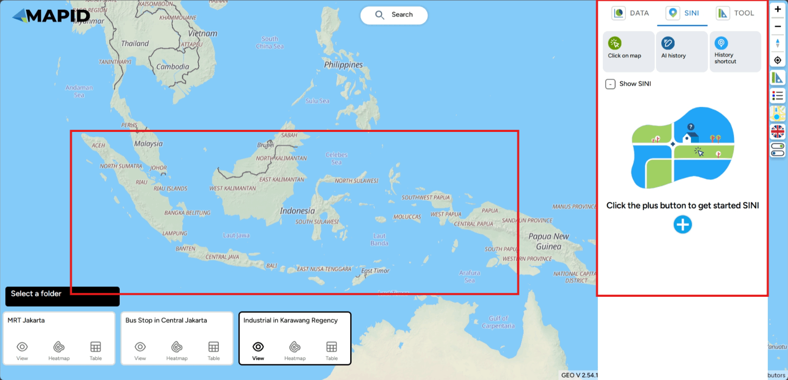
Note: Currently, this feature can only be used for areas in Indonesia as the available data is limited to locations within Indonesia. As more data becomes available, the insights obtained will become richer. This is ideal for conducting local analysis in the specified location by viewing the various information displayed.
Next, you can click on a point on the map, and data along with nearby POI points will appear, including supporting data such as demographic data, expenditure and routine needs data, land use and estimated land value data, and much more that you can explore.
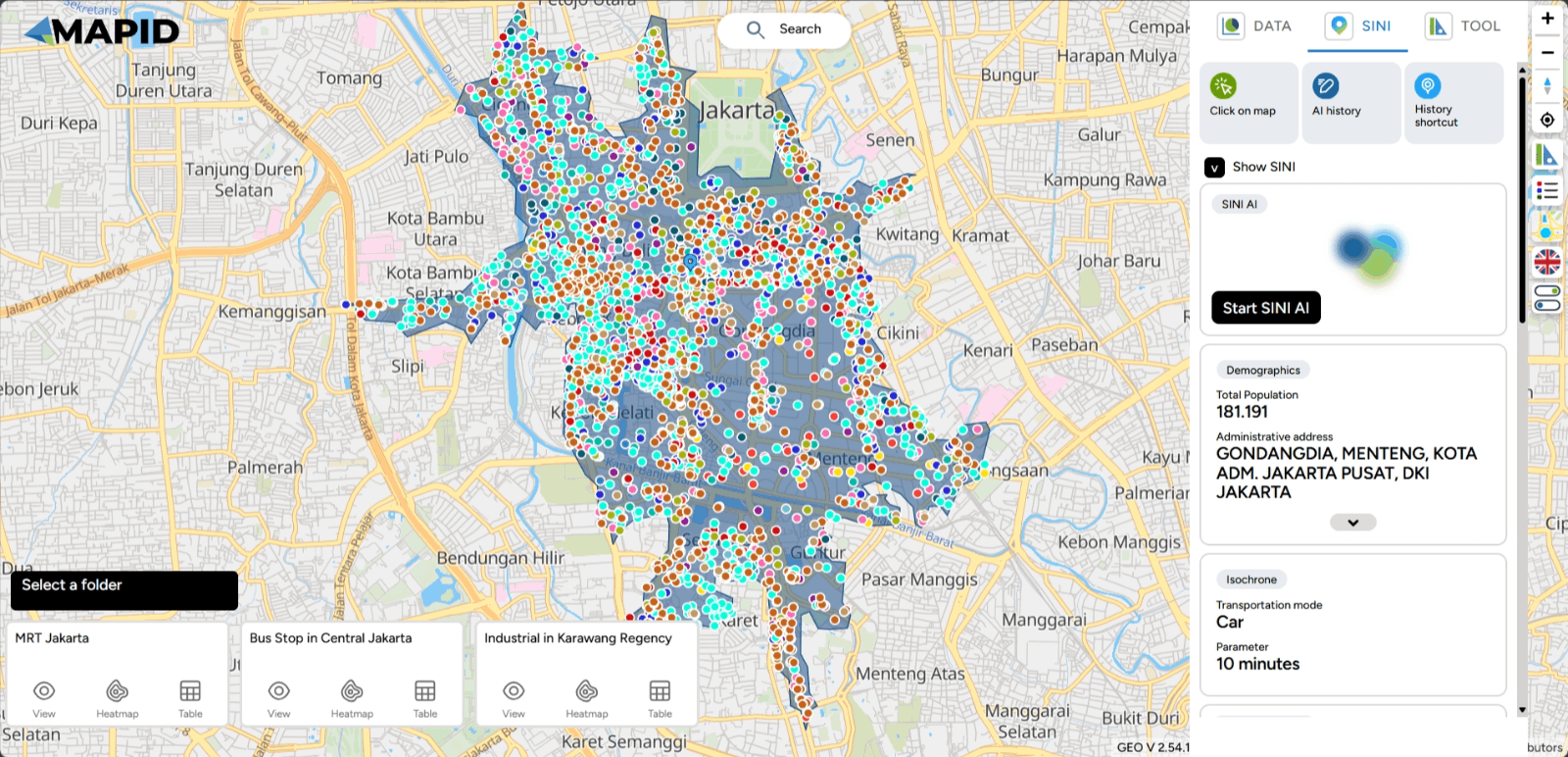
A lot of data is generated by SINI. In this case, I will show information related to demographics, which includes the village areas that form the isochrone at that location, the population count within that isochrone, religion, gender, and more.
Check other data to generate more insights, but don't miss out on one feature that can help you get the most out of location analysis—using chat with SINI AI, of course!
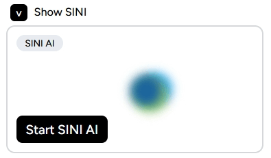
Click Start SINI AI and chat like you're brainstorming with a friend to get hyperlocal insights.
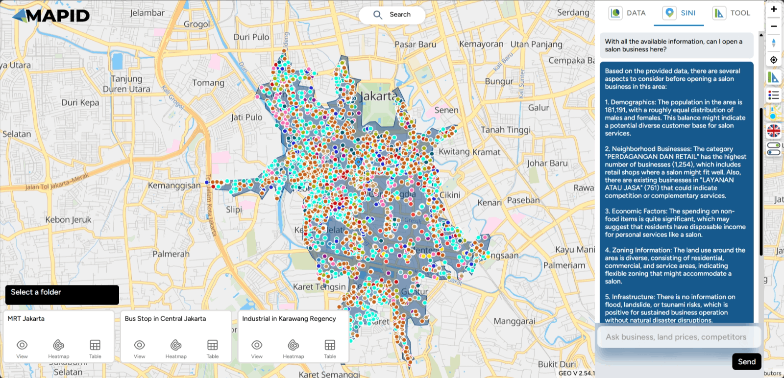

For example, if you want to open a salon in this area of Jakarta, is it possible or not? See the results! You can expand the conversation with this button.
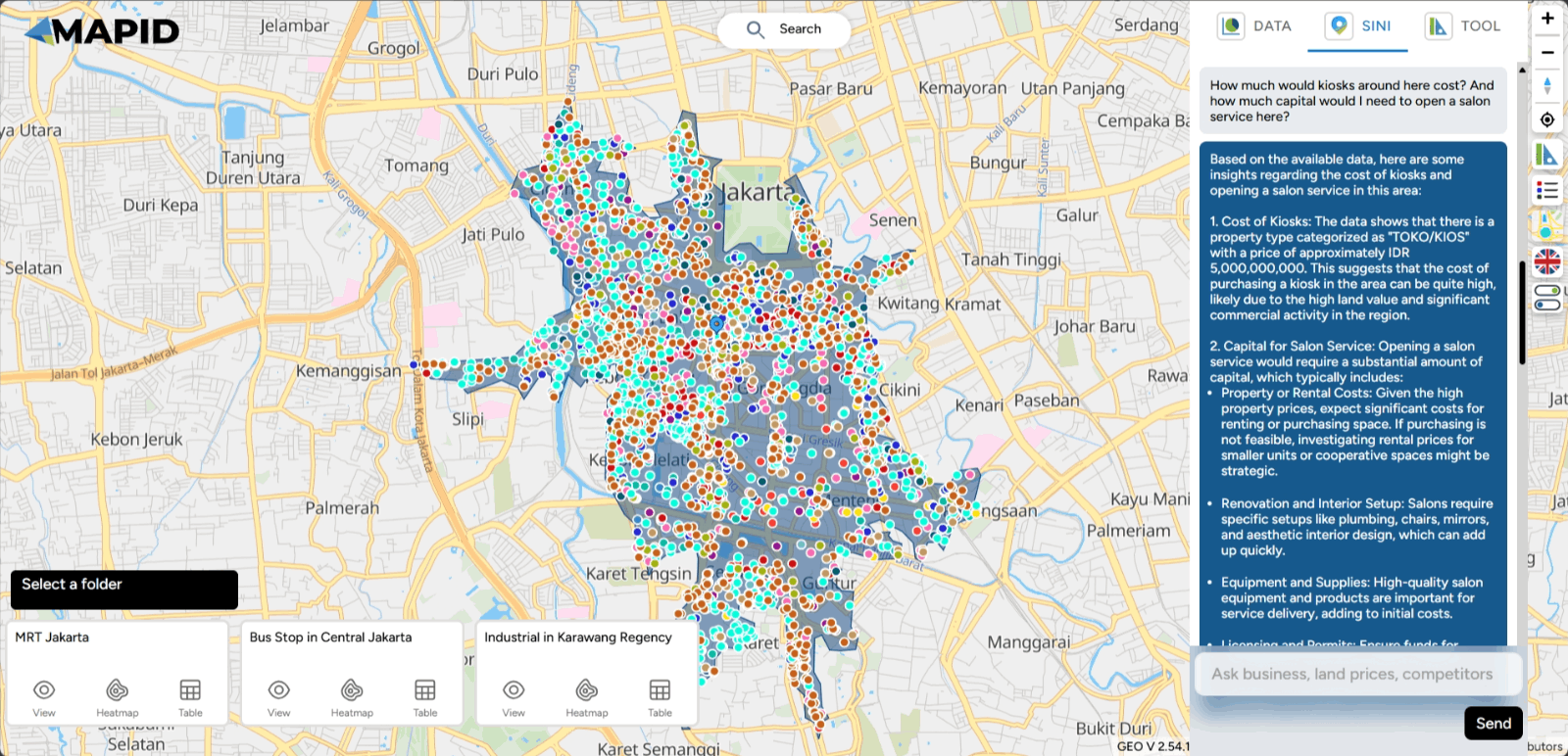
Explore for further information!
TOOLBOX In addition to Map Editor, you can also use the Toolbox feature in Map Viewer. You can access six toolboxes available in GEO MAPID: Distance, Elevation, Area, Radius, Isochrone, and Grid Count Point, just like when you access them in Map Editor. Here's an explanation!
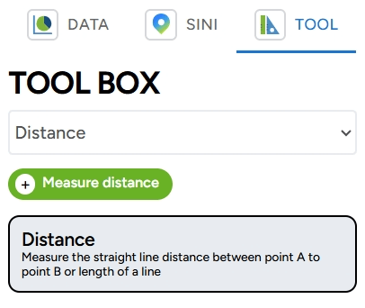
1. Distance
Simply put, Distance is used to measure the distance between two or more points on the earth’s surface. You can define the distance by drawing a line according to your needs. Let's try measuring the distance.
To measure the distance, you can click the Measure Distance button. Then, select two points that you want to measure the distance between. For example, you can determine the distance around the Monas area via Jalan Merdeka. Add points from the start point to the endpoint, and once done, you can double-click or press the Enter key to complete the measurement. You will then see the result displayed on the right sidebar of your screen.
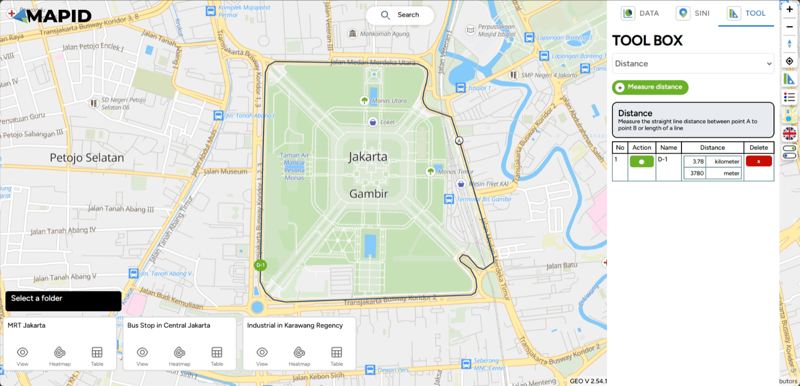
If you want to highlight the previous line, select the black dot in the Action column. To delete the line, you can click the ( x ) symbol in the Delete column.
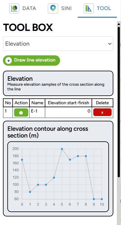
2. Elevation
In addition to distance, you can also measure elevation using the GEO MAPID Toolbox. This toolbox accommodates elevation measurements by displaying a cross-section of several sample points that form a line. This tool also functions to analyze the topographic structure of an area. Before that, switch your basemap to satellite for a more suitable interpretation.
For example, you want to measure the elevation from Gunung Tangkuban Parahu to the nearest residential area. You can follow the previous instructions by adding points from the start to the end. To begin measuring elevation, select Draw Line Elevation and click once on the map to add a point. Once you have finished drawing the cross-section with several sample points, you can complete the line by double-clicking or pressing the Enter key.
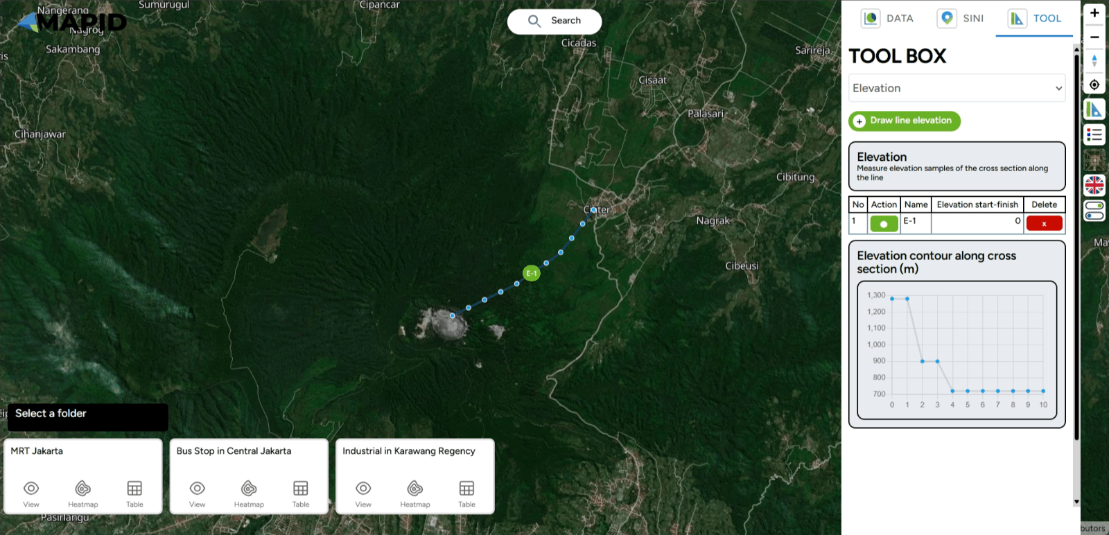
After finishing, the elevation measuring process will begin, as shown in the image below. Once the measurement is complete, a cross-section diagram of the elevation between the upstream area and the residential area will appear in the right sidebar. The graph above shows a gradient from the starting point to the endpoint with elevation, as shown in the image.
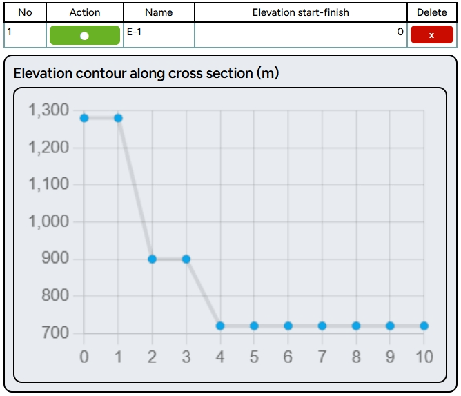
Please note that this data is sourced from the Mapbox API with a 5-meter resolution and units above sea level. To add more cross-sections, you can follow the previous instructions. If you want to highlight the line to be targeted, click the point in the Action column, or if you want to delete the elevation cross-section, click the ( x ) symbol in the Delete column.
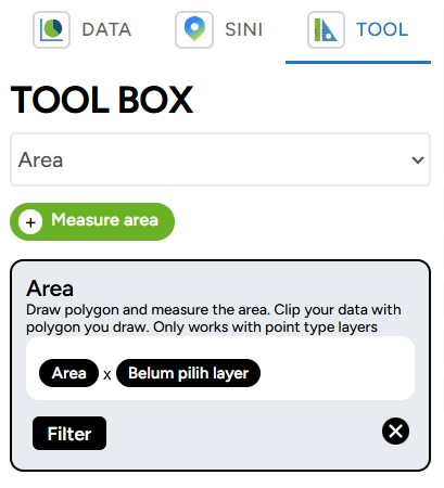
3. Area The third toolbox available in GEO MAPID is Area. This toolbox helps you calculate the area of a measured region.
To measure the area of a region, you can follow instructions similar to the previous ones by selecting the Measure Area button. Then, you can draw the polygon of the area you want to measure. Once done, you will find the area measurement table on the right sidebar.
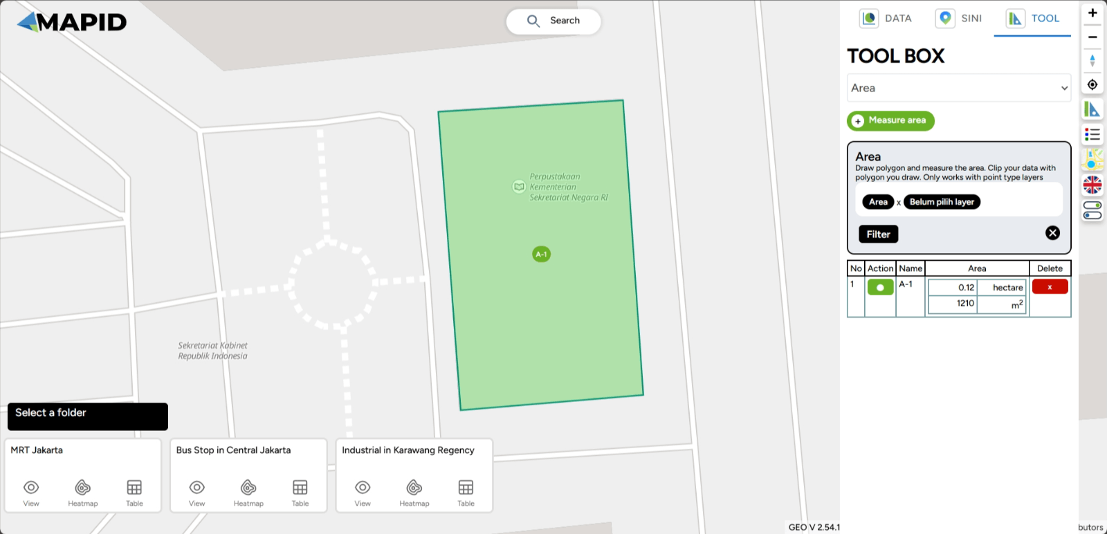
To perform a new measurement, follow the previous instructions by selecting the Measure Distance button and drawing a new polygon. If you want to highlight the line you want to focus on, click the point in the Action column. If you want to delete the previous area measurement, click the ( x ) symbol in the Delete column.
4. Radius
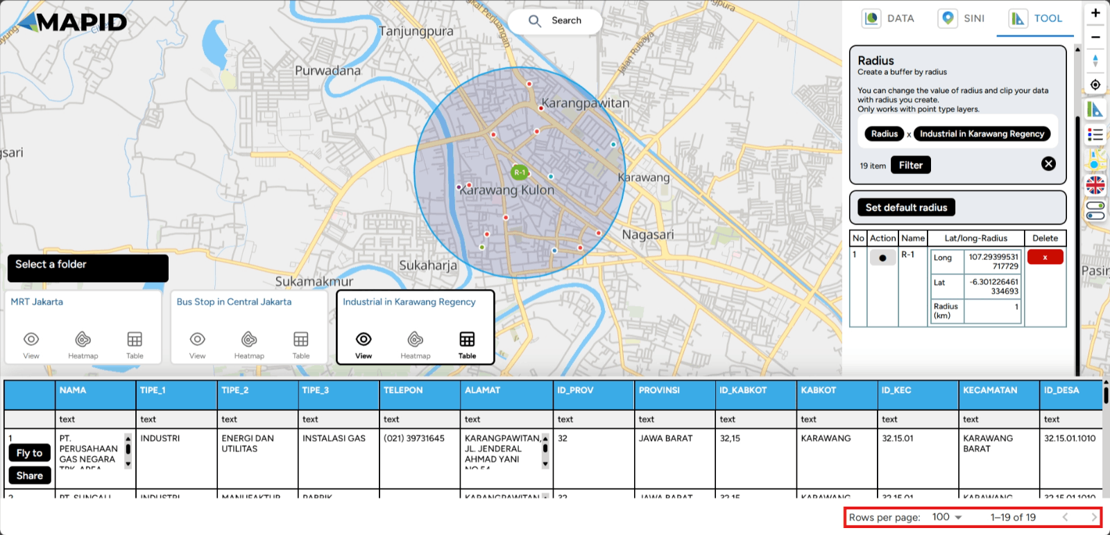
The fourth toolbox is Radius, which helps you determine the range in the shape of a circle from a selected point. Additionally, this toolbox is used to perform data clipping based on the selected radius range.
As an example, this toolbox will create a buffer with the radius you choose. In this case, the GEO MAPID toolbox will provide results in the form of centroid points based on the set radius. Then, the data within that buffer can be filtered or clipped using the filter button. Let’s try using the Radius toolbox!
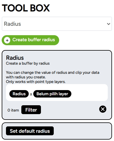
To define the range, follow similar instructions as before, but this time select the Create Buffer Radius button. Then, click on the location you wish to select. On the right sidebar, you can adjust the radius or range by moving the slider left or right.
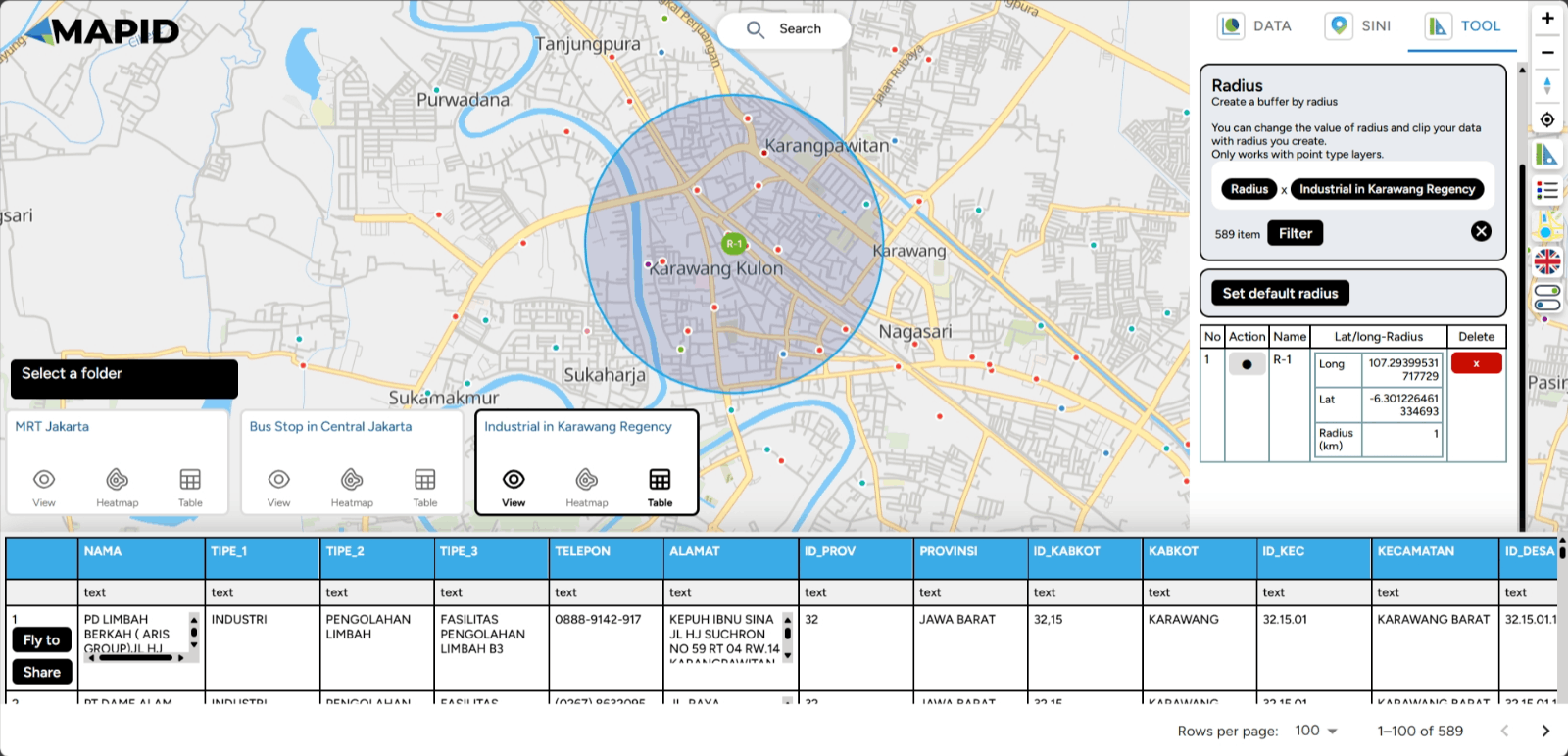
You can also filter points based on the range you set using the Filter feature. For example, you want to view industries in Karawang, but you want to visit places within a one-kilometer radius from your current location. You can click the Filter feature.. Automatically, the toolbox will filter points within that five-kilometer radius. Done!
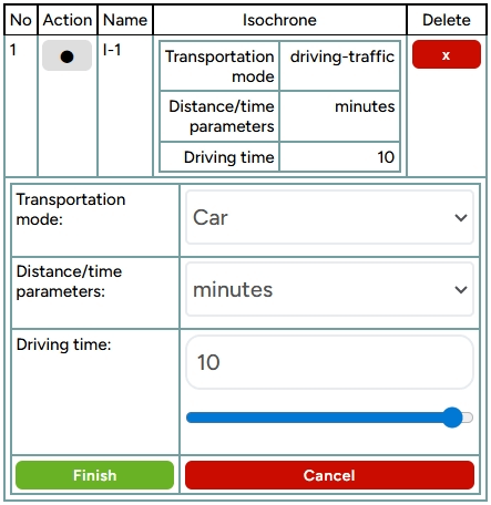
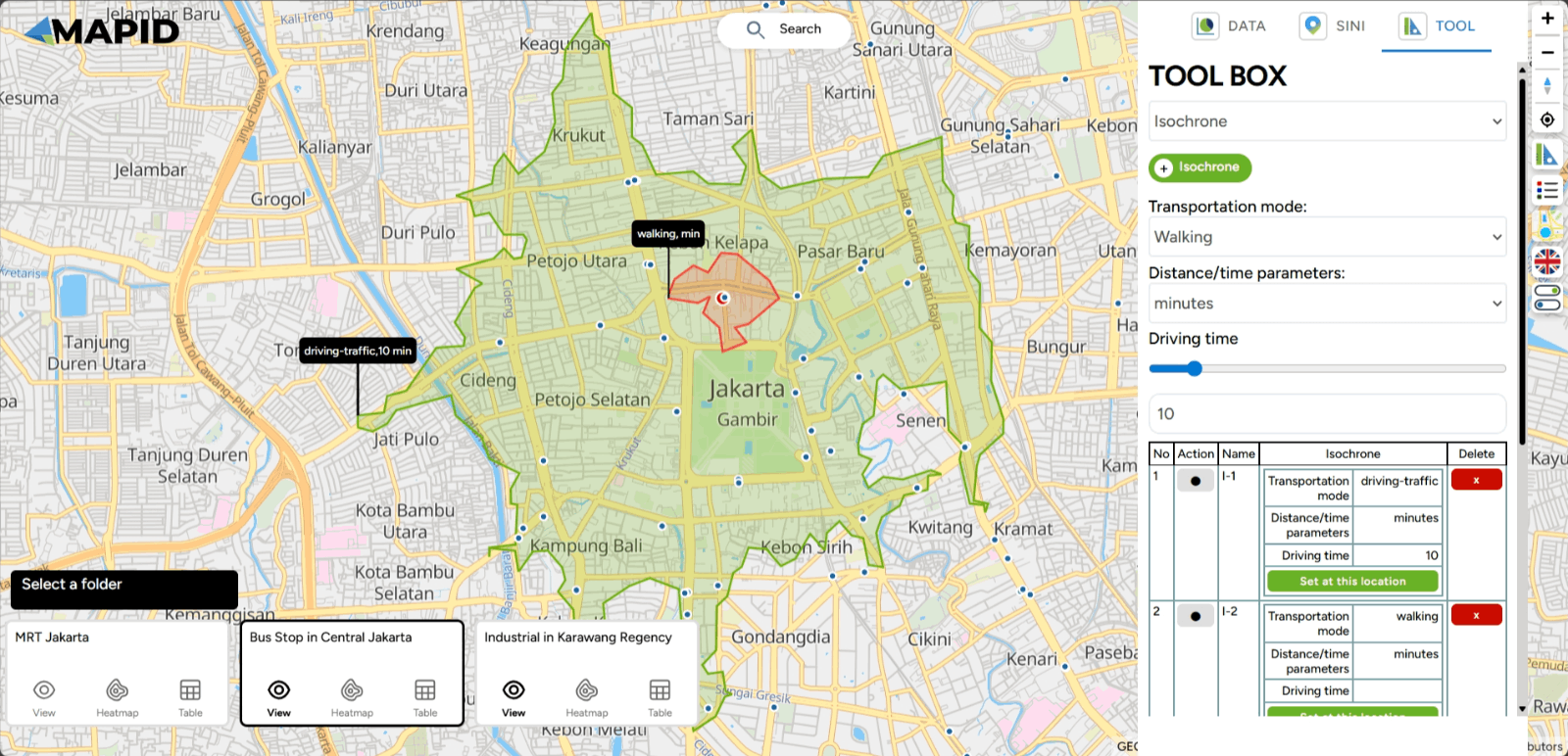
5. Isochrone The Isochrone toolbox is a spatial feature in GEO MAPID used to depict the area that can be reached from a specific point within a certain period, usually considering a particular mode of transportation or speed.
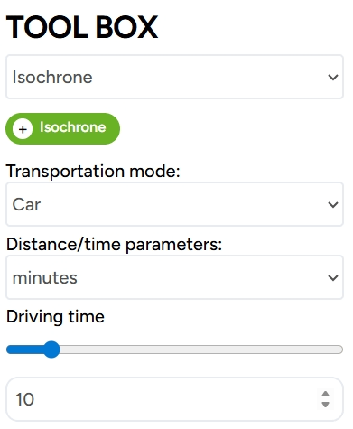
Using the Isochrone feature is quite simple. Click on the Vehicle Mode option, and you can choose the vehicle you wish to use. Four vehicle modes are available: car, car with traffic, walking, and cycling. Then, select the Distance/Time Parameter to determine how far you will travel, and set the Travel Time duration. Click the Isochrone button to select the point you want to define on the map.
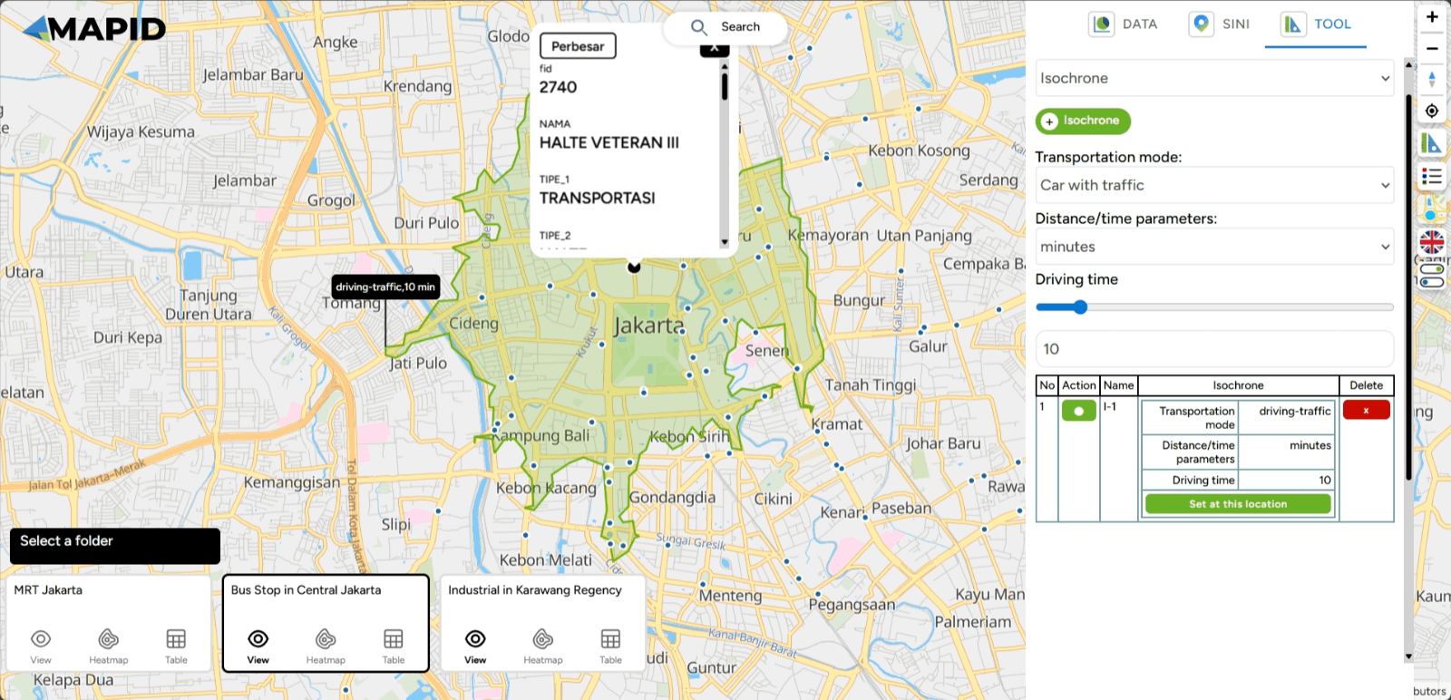
Once the area is generated on the map, you can add more areas to the same point by clicking the "Set Location" button. You can then adjust the travel settings according to your preference. Within this tool, you can configure the mode of transportation, distance/time parameters, and travel duration. Once you're done, click "Finish."
After completing these steps, the area that can be reached from the specified point will be displayed. Done!
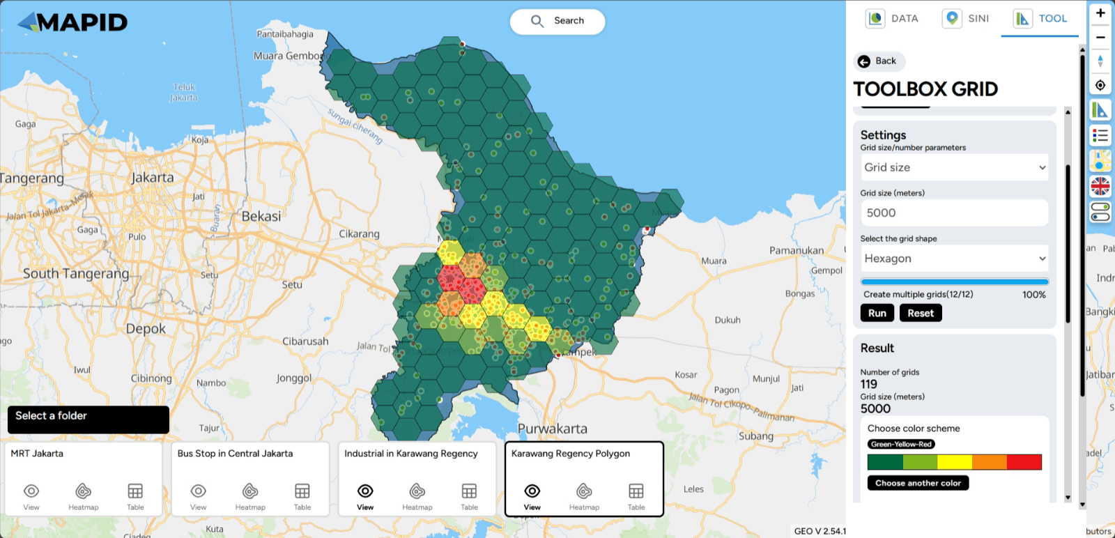
6. Grid Count Point Lastly, the Grid Count Point tool! This tool is useful for counting the number of objects or points within a specific area that is divided into smaller grids. To use it, you need to have a point layer and a polygon layer prepared.
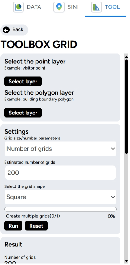
Then, you can adjust the number of grids/grid size, estimated number of grids, and the mode of the grid to be displayed on the map. For example, in the Transportation & Industry project, you open the industrial layer in Karawang (point) and Karawang Regency (polygon). You want to determine the point density aggregated into grid format.
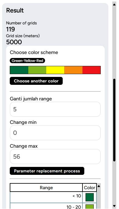
The result of the Grid Count Point tool will appear similarly to a heatmap, showing the concentration of points within the grid areas.