Grow Business with Location Analytics (ENG)
Find Your Potential Area to Increase Your Business! Mapping Your Data to an Effective BI Dashboard Capture Data Instantly with FORM MAPID!Updated : 08 Jul 2025
Mapping Your Data to an Effective BI Dashboard
Creating a Business Intelligence Dashboard
If you are a business owner who requires geospatial data for business analysis, the Business Intelligence Dashboard feature is the solution. The BI Dashboard helps you integrate geospatial data with your business data, such as sales, expenditures, and more. Additionally, your BI Dashboard data is updated and analyzed in real-time.
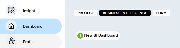
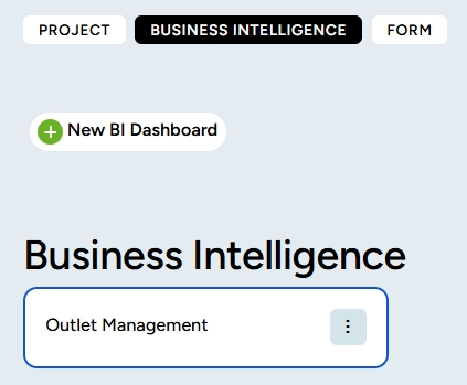
To create a BI Dashboard, click the Dashboard menu in the left sidebar of your screen. Then click the Business Intelligence feature, and select New BI Dashboard.
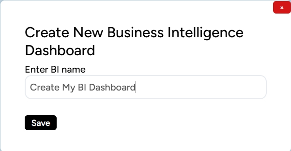
Next, you will be prompted to fill in the name of your BI Dashboard. After completing it, click Submit.
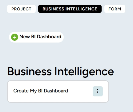
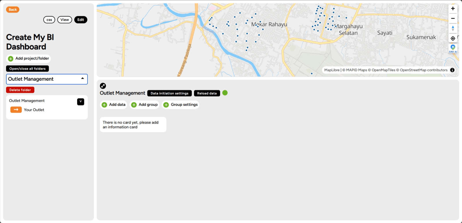
Done! The BI folder you created with your chosen name will appear.
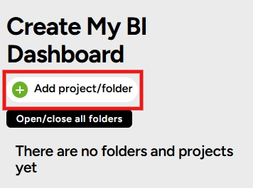
Adding a Project or Folder How do you add a project or folder to the BI Dashboard? It's easy! You can follow the steps below:
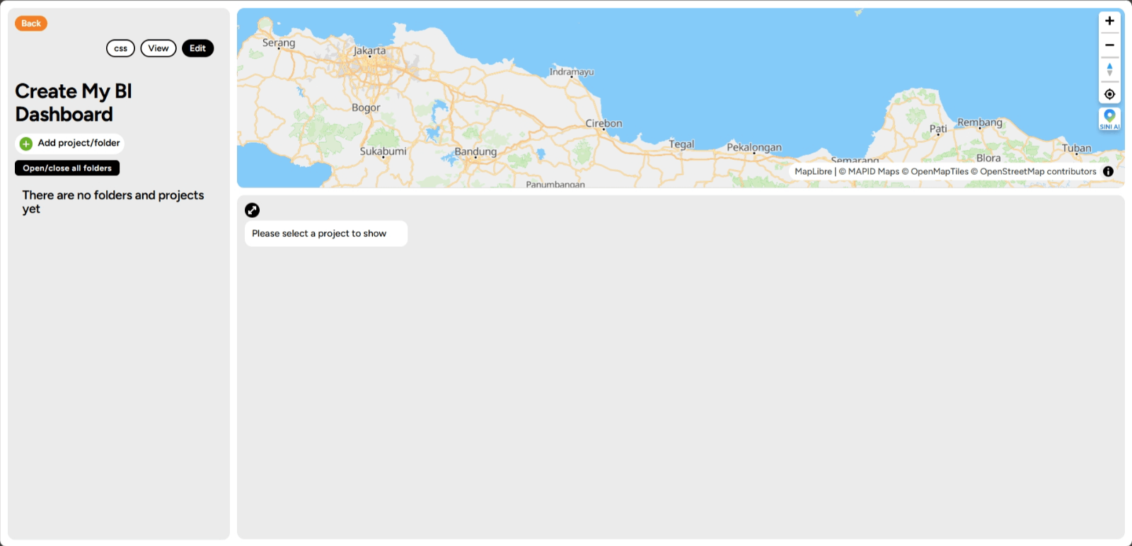
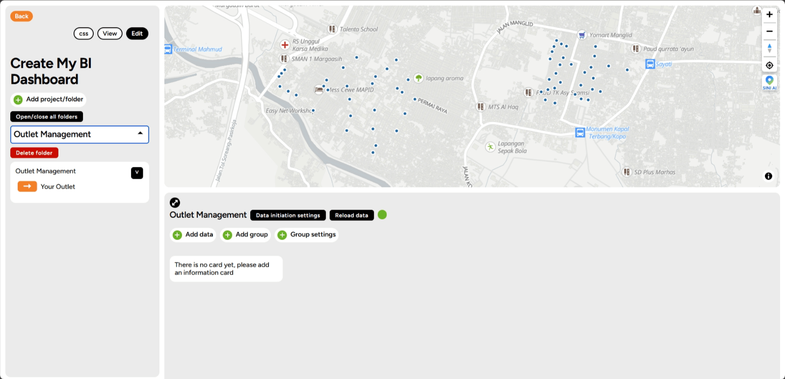
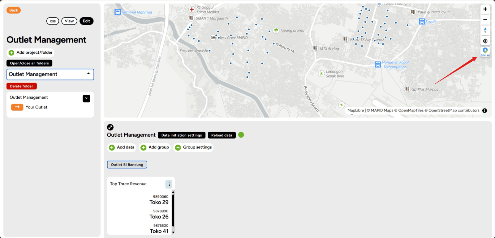
1. To add a folder to BI, make sure you are in the BI feature, and here is the main view of the BI feature.
2. In the left sidebar of your screen, you will find the Add Project/Folder feature, click that menu.
3. You will have two options to choose from: Add Folder or Add Project.
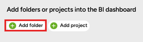
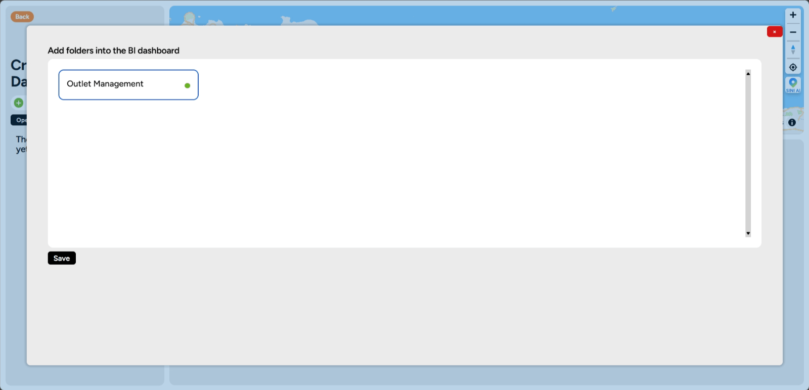
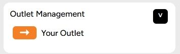
4. This time, we will try adding a folder. Click the Add Folder feature, then you will find the folder you previously created in the main dashboard. Choose the folder you want to add to the BI Dashboard, then click Save.
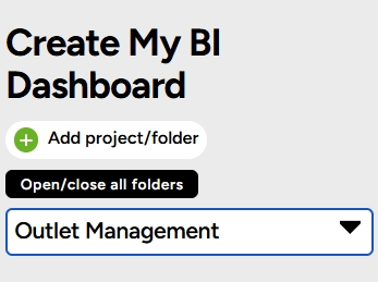
5. Done! The folder you added will now appear on your BI Dashboard homepage.
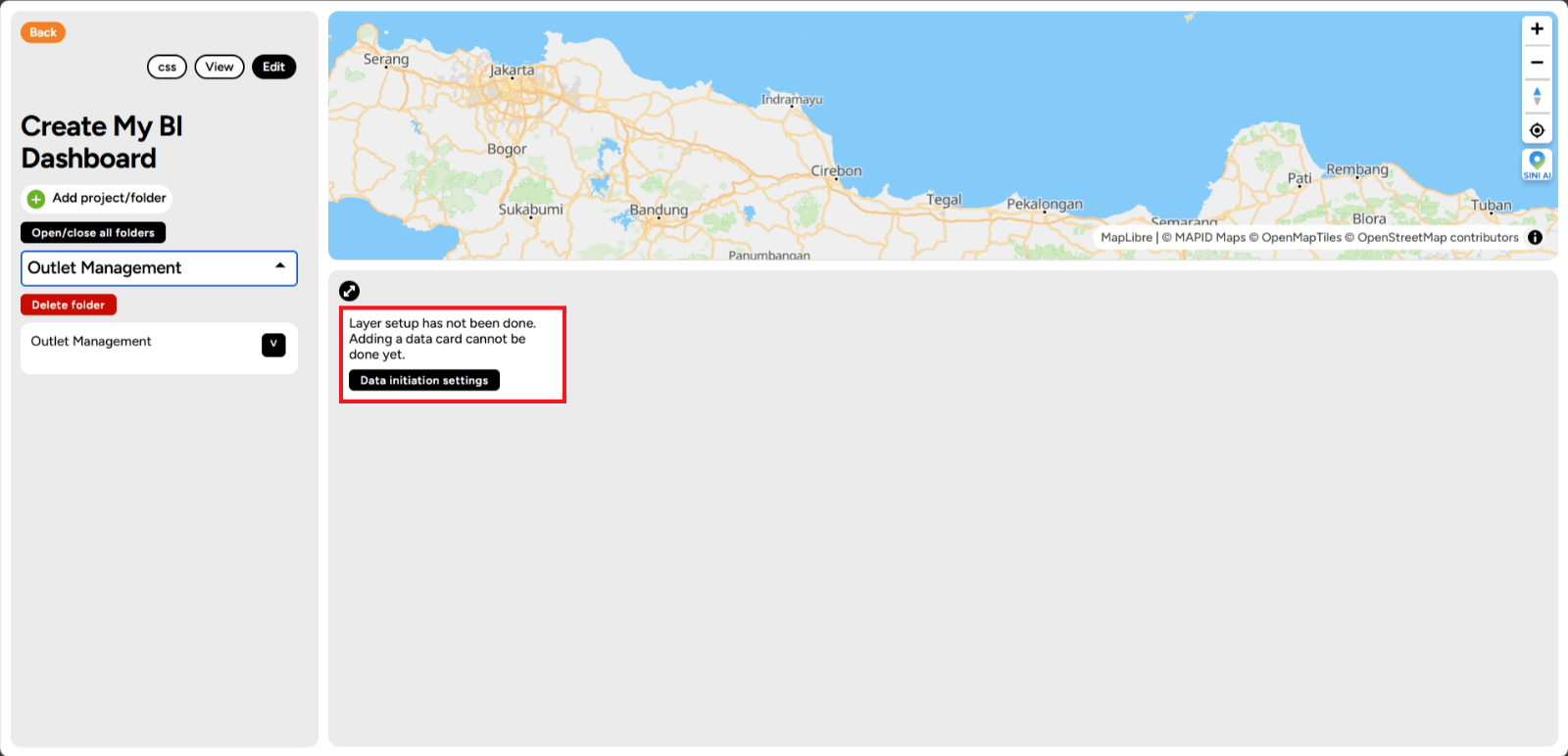
Data Initialization Settings
1. Open the GEO MAPID platform, and make sure you are on the BI Dashboard page.
2. Ensure that in the BI Dashboard, you have added a folder containing the data to be displayed on BI.

3. Below is a BI that already has a folder within it. For example, click the dropdown under Special BI Folder and check the Maps for BI layer. Then click the Data Initialization Settings button.
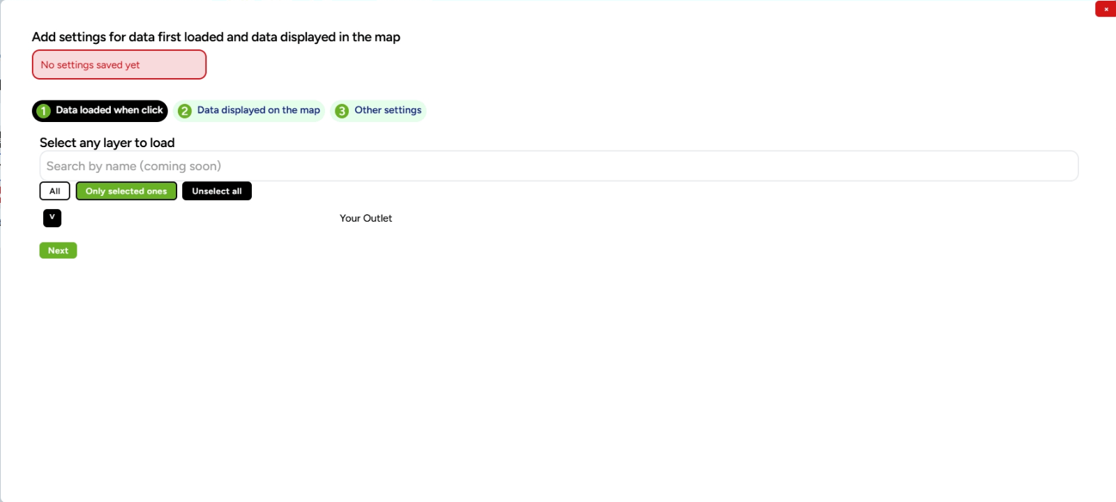
4. You are now in the "Data to Load" menu, check the layer you selected in your project, and then click Next.
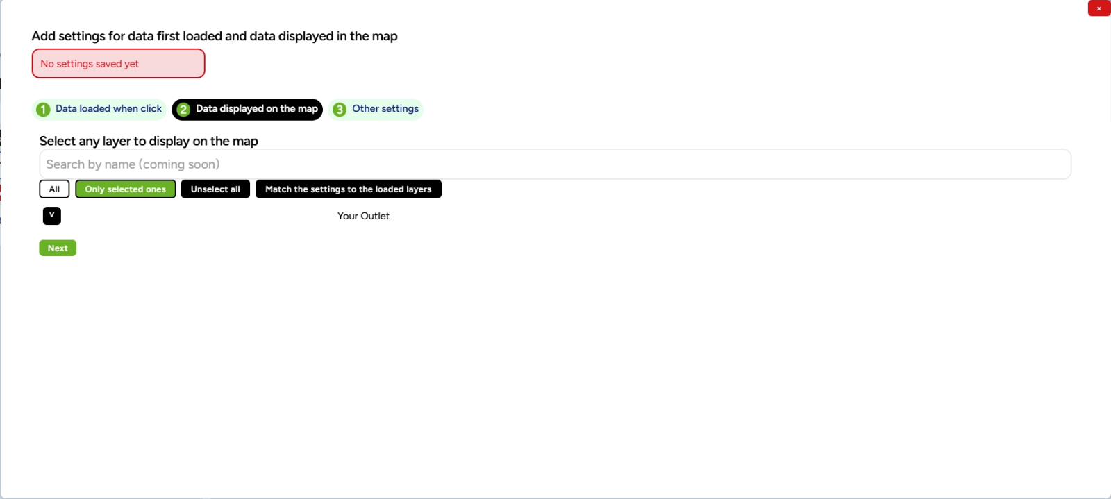
5. Then, you will enter the "Data to Display on Map" menu, check the layer you selected in your project, and click Next.
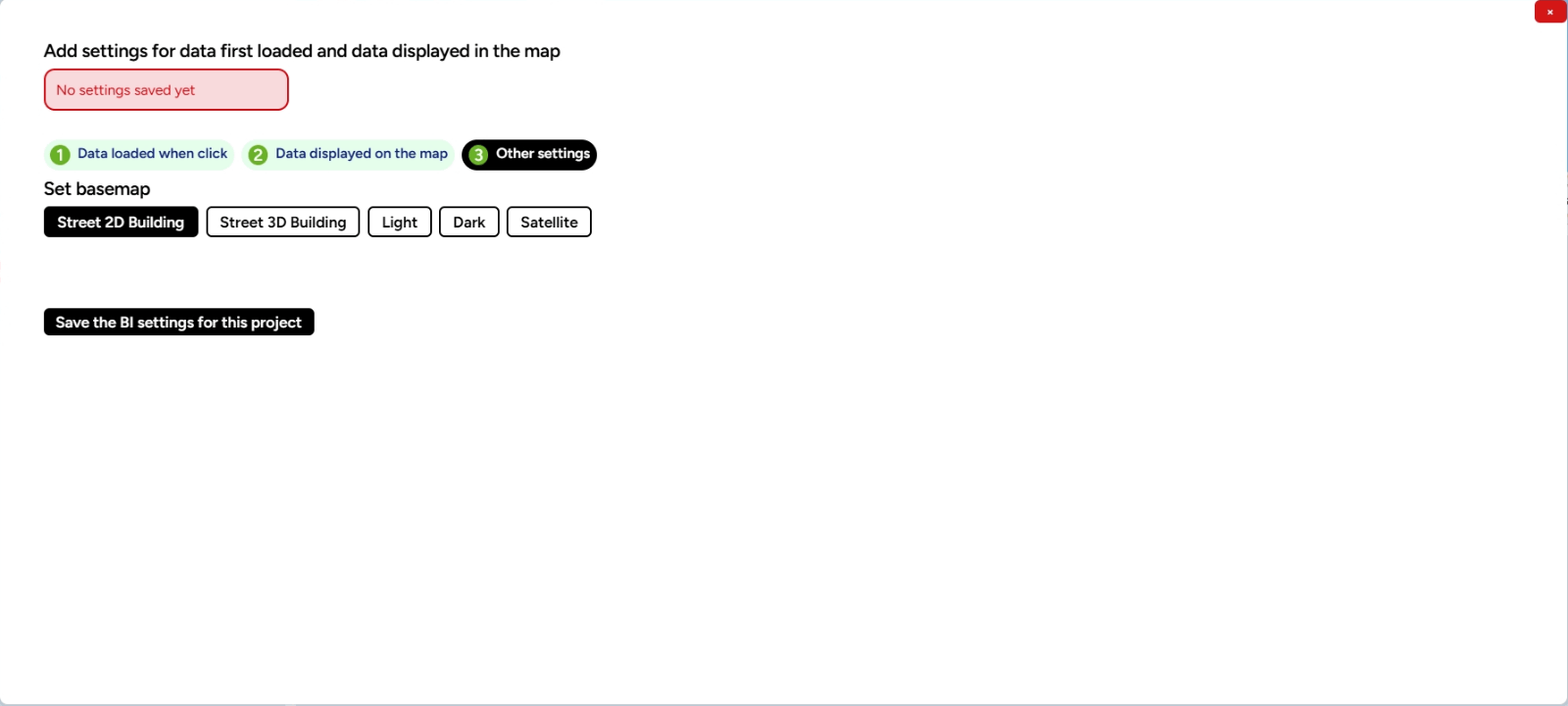
6. Finally, in the "Other Settings" menu, you can freely choose the basemap or map to be displayed on the map later. Then click Save BI Settings for This Project.
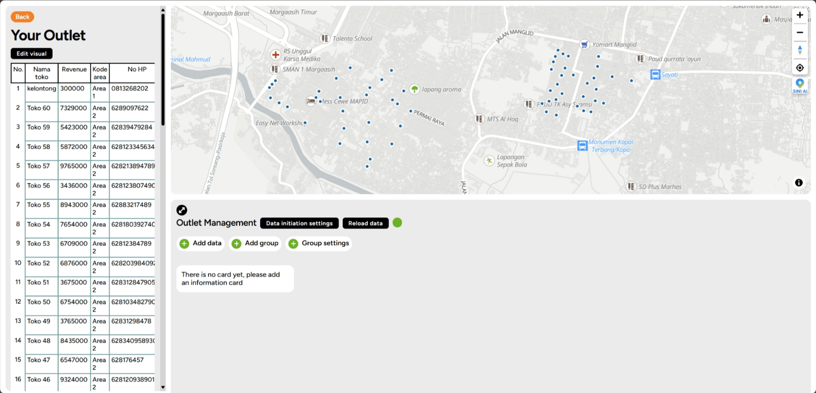
7. Here’s what the map will look like after the settings are applied.
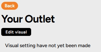
8. Click the right arrow button as shown in the image below to edit the visuals later.
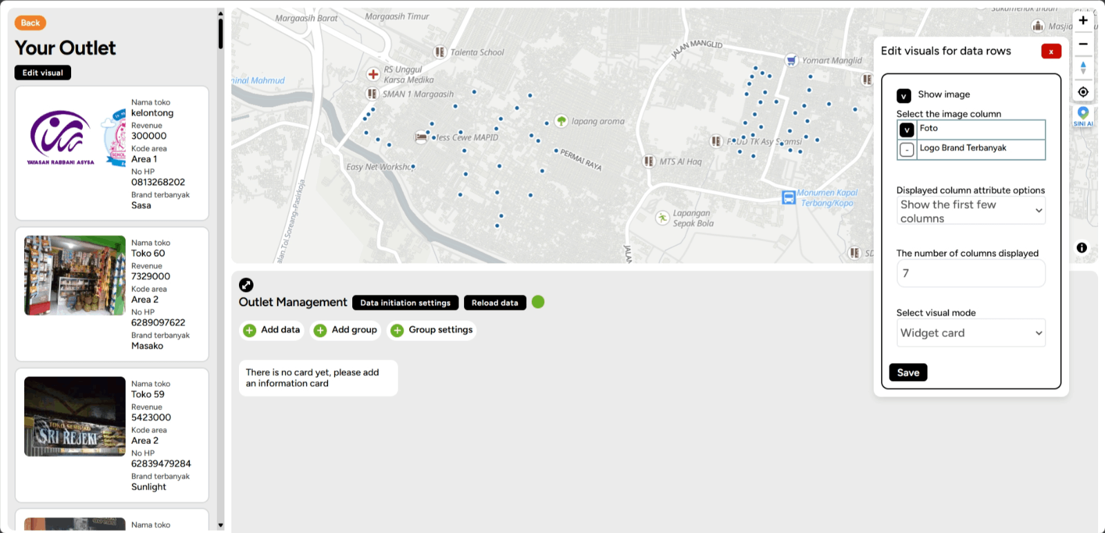
9. Click Edit Visual.
10. On the right side of your screen, there will be a pop-up for editing the visual for your BI layer.
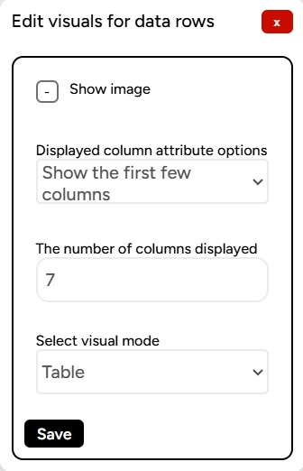
11. In the pop-up for editing the data rows, you can adjust the following:
a. Display image: to display columns containing images.
b. Attribute options to display: you can choose to either show the first few columns or customize them.
c. Number of columns to display: you can set how many columns will be displayed in the data rows.
d. Choose the visual mode: options include 'table' or 'dynamic' to display visuals on your data.
Once done, click the Save button.
12. The data visualization on your BI Dashboard will appear like this.
Creating a Card The BI Dashboard feature is designed to display data that will be transformed into cards taken from the layers of your project. How do you create cards on the BI Dashboard? Here are the steps:
1. Make sure you have created a BI Dashboard and it contains the data as described in previous steps.
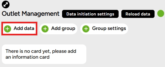
2. Click Add Data to create a card.
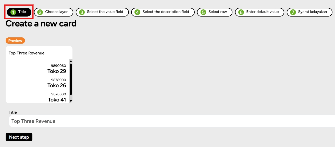
3. The first step is to create a title.
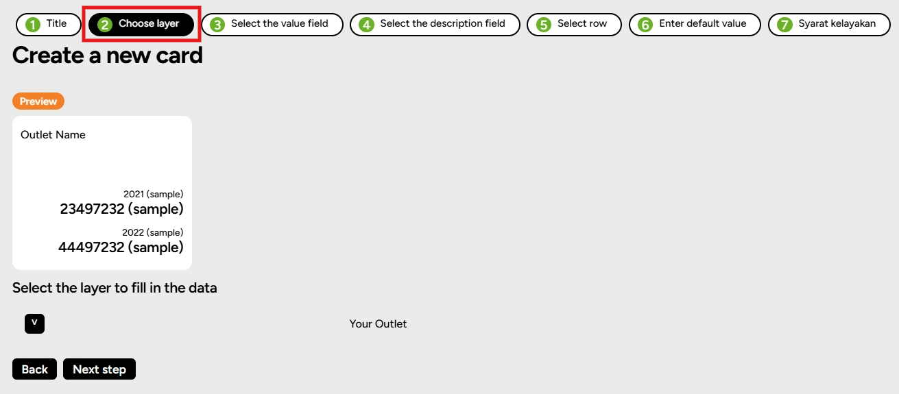
4. Check the layer you want to select.
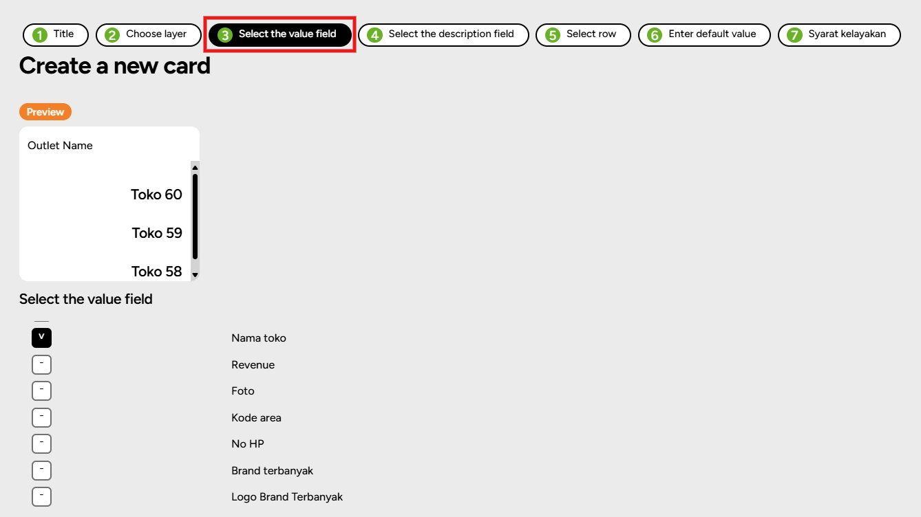
5. The third step is to check the column that contains the value column.
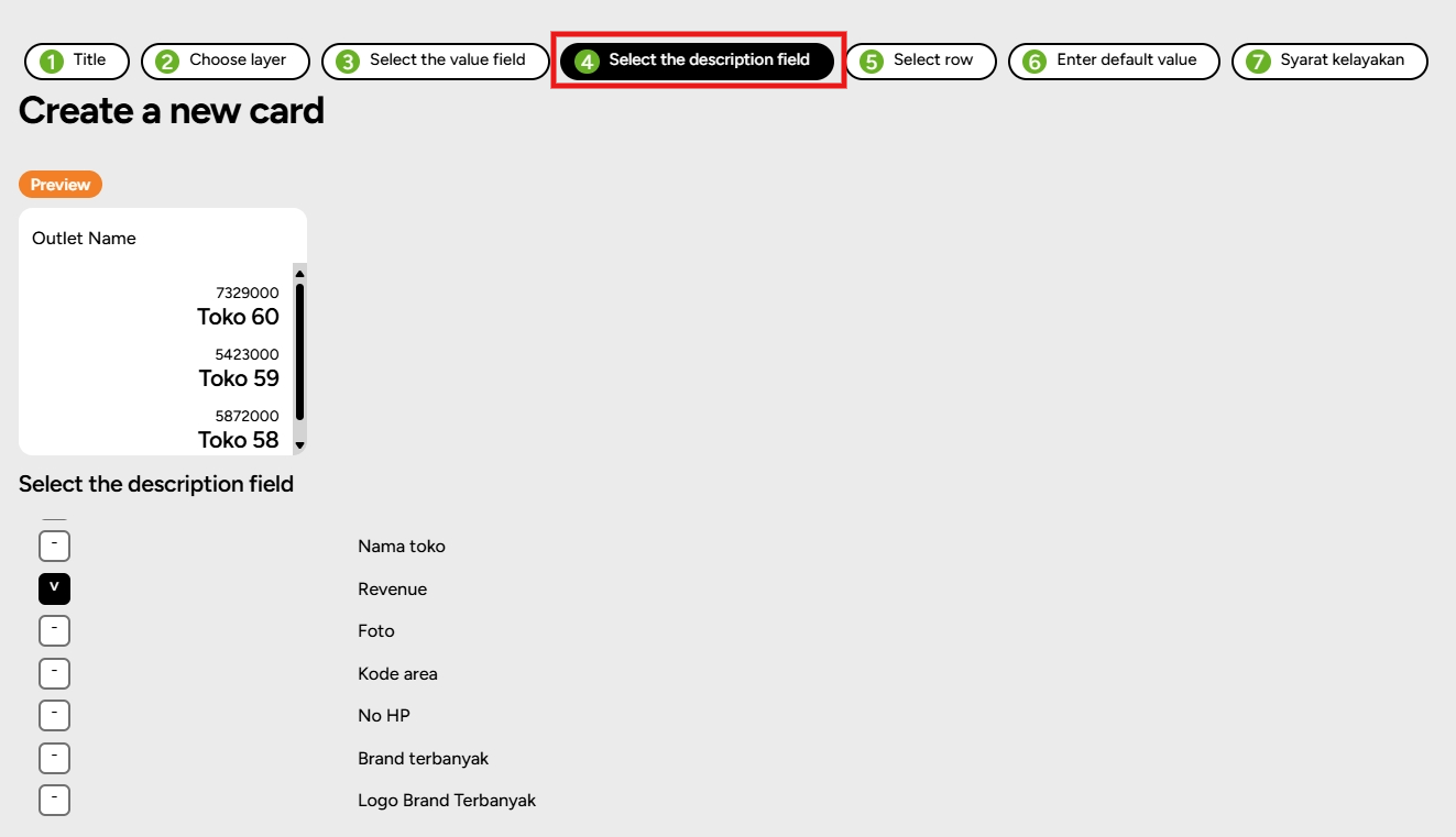
6. Fourth, under Select Description Column, check the column as needed.
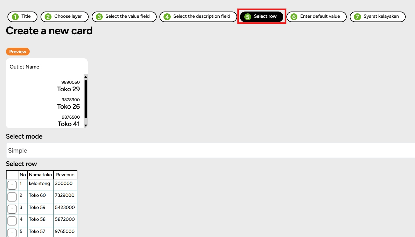
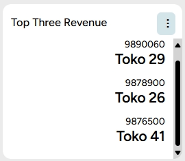
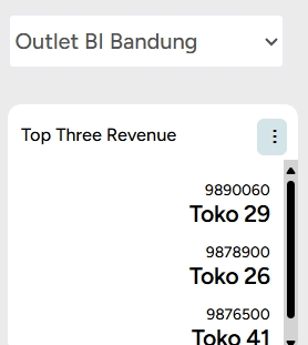
7. Fifth, you can choose rows by checking the box in the next column according to your choice. Choose top three for each revenue.
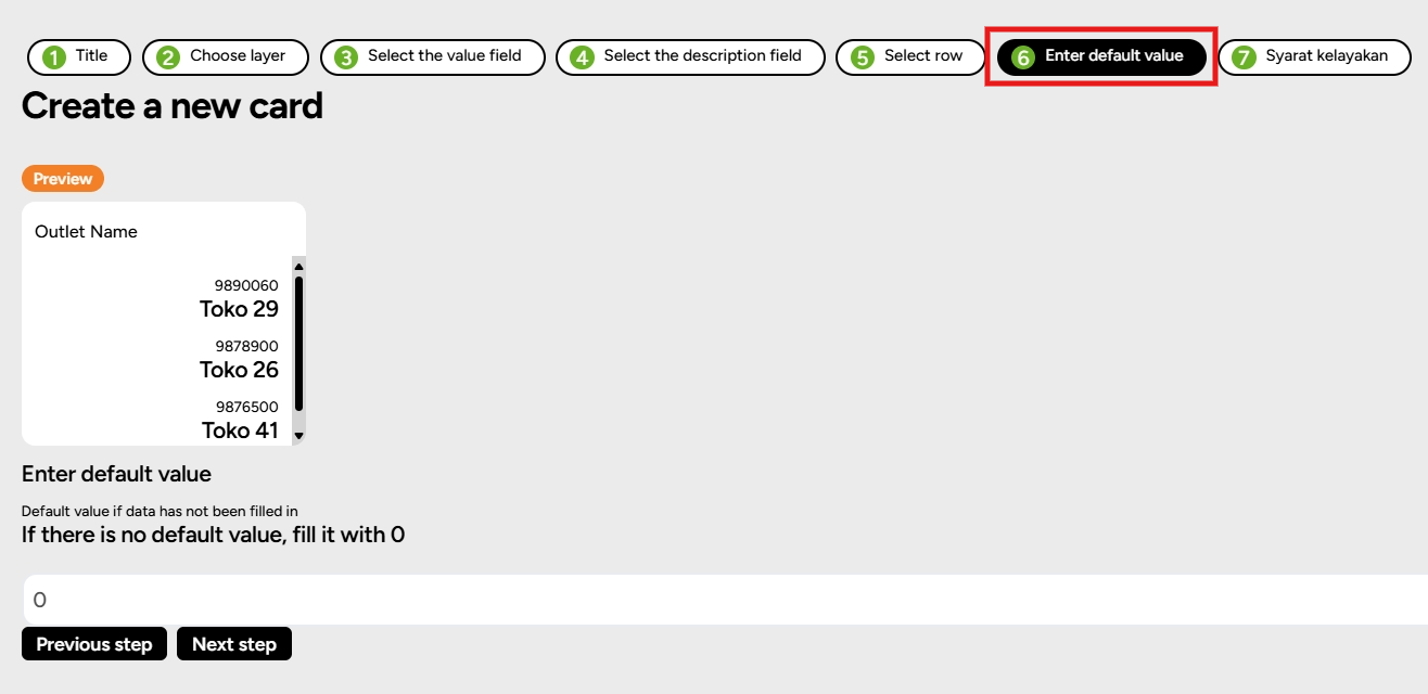
8. Next, Enter Default Value (if any).
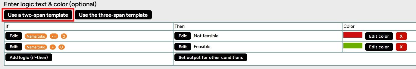
9. In the last step, you will be prompted to fill in the Eligibility Criteria (optional). Here you can use a condition or not. If you want to use a condition with only one condition, click Add "If-Then" Logic or Set Output for Other Conditions.
Alternatively, you can use the Two Range Template.
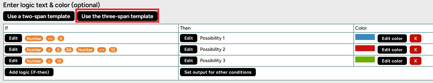
Furthermore, you can also use the Three Range parameters.
10. Once done, click Add Data. The card will appear under your map. You can follow the above steps to create additional cards.
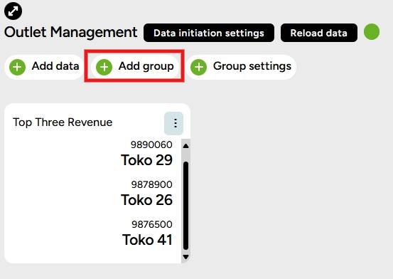
Add Group to Organize Cards
1. After the card is created, you can create a group on the BI Dashboard by clicking Add Group.
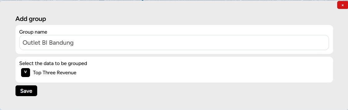
2. Give the group a name and select the cards (check the layer options) to be grouped, then click Save.
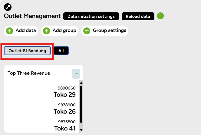
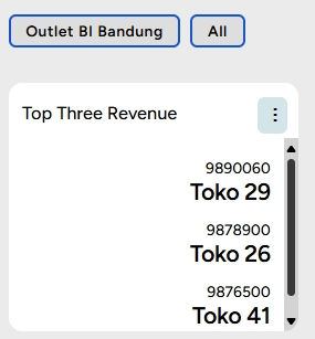
3. The result is that you will see the card group created as shown below.
Group Setting
1. After the cards are grouped, users can also change settings on the group by clicking Group Settings.
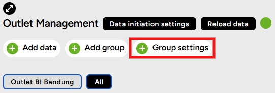
2. In Group Settings, users can adjust the settings to customize the appearance of the card group.
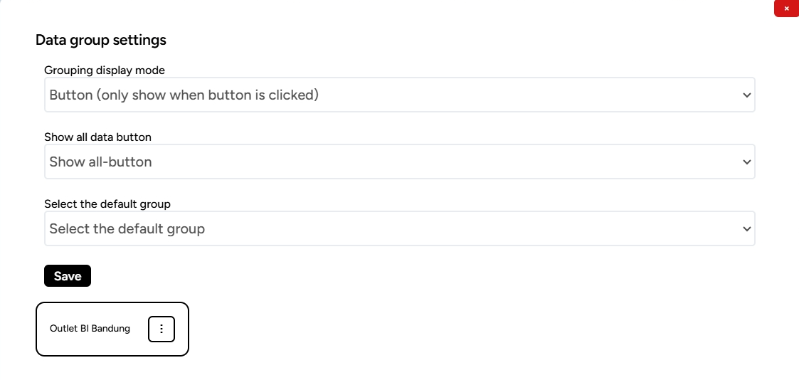
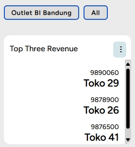
a. Display Grouping Mode:
In Group Settings, users can adjust the settings to customize the appearance of the card group. Button (only show when clicked)
Expand (show all and group them)
Option (only show if selected)
b. Display All Data Button: Show all button
Hide all button
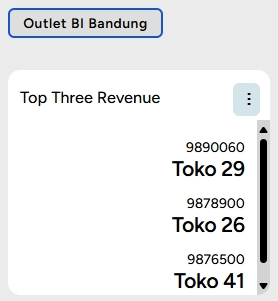
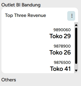
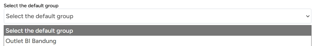
c. Select Group to be Displayed First (Default Group):You can set which card group will be displayed first on the dashboard page. For example, if you want the "Outlet BI Bandung" card to be displayed first, that card will be saved as the first to appear.
SINI AI in Business Intelligence
SINI AI is an assistant designed to provide location-based intelligence solutions. SINI AI helps analyze and present information based on geographic and demographic data to understand patterns and develop strategies in various contexts, such as urban planning, resource management, and more. SINI AI utilizes location-related data to provide valuable insights, enabling individuals, companies, and organizations to make more informed and accurate decisions.
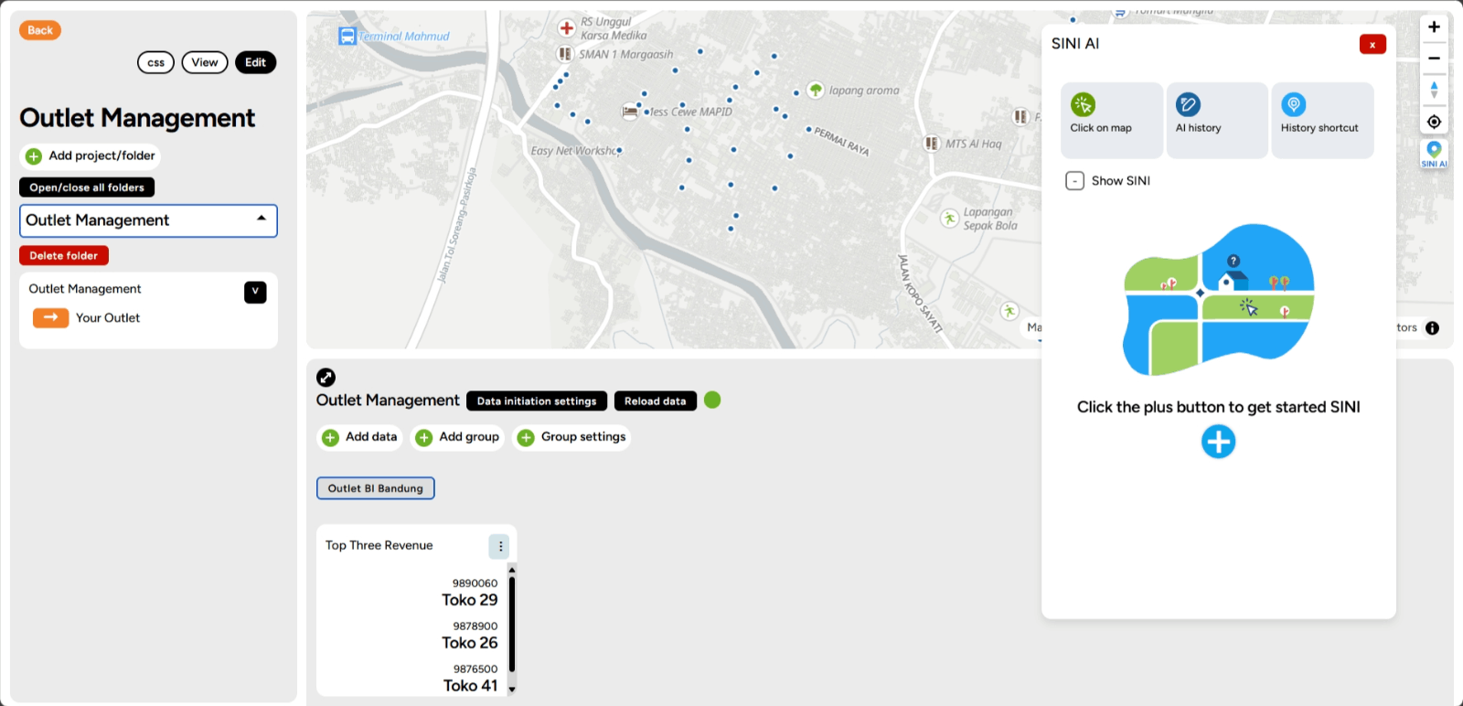
1. Select any dashboard thay you have to analyze. For example, look at Outlet Management dashboard.
2. Then, enter the folder you created, where you can find the SINI AI feature in the sidebar on the right.
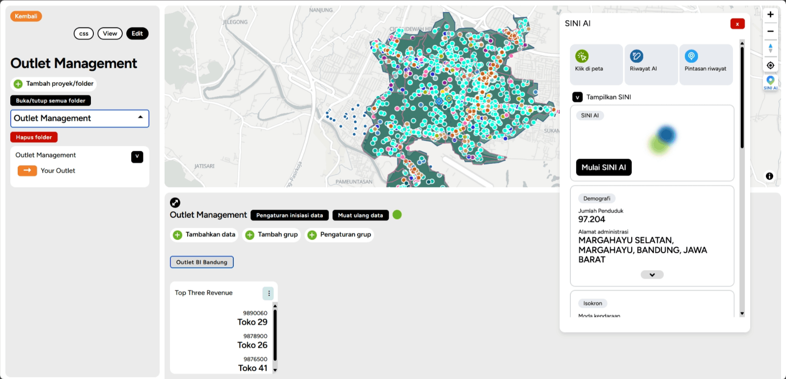
3. Click on the SINI AI feature, and then you can start by clicking the plus icon and selecting SINI. Then, click on a location on the map to get information about that area.
4. Next, data and POI points around the selected area will appear, along with additional supporting data such as demographic data, expenditure and routine needs, land use and land value estimates, disaster data, and much more that you can explore.
5. In addition to that, you can also utilize the Chat with SINI AI feature to get more detailed results. You can simply click the Start Chat button to begin.

6. You can type your question in the prompt below, and then click Start Asking to get an answer from SINI AI.
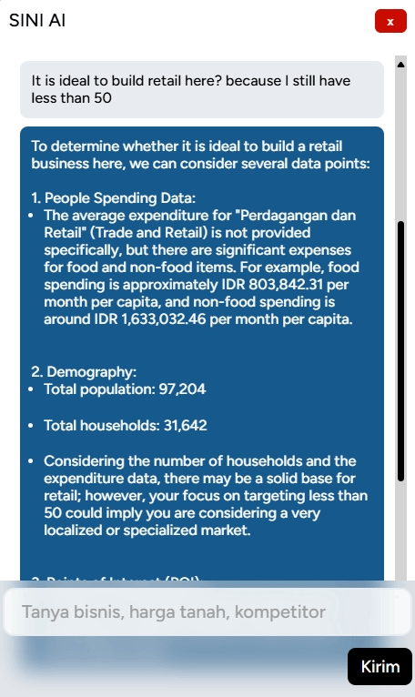
7. SINI AI will answer your question by providing suggestions and considerations related to the location you are exploring to help you make better and more informed decisions. Happy exploring!